Choosing an interior paint color.
Chapter 3
Chapter 3. The biggest hurdle: “What color should I paint my interior?”
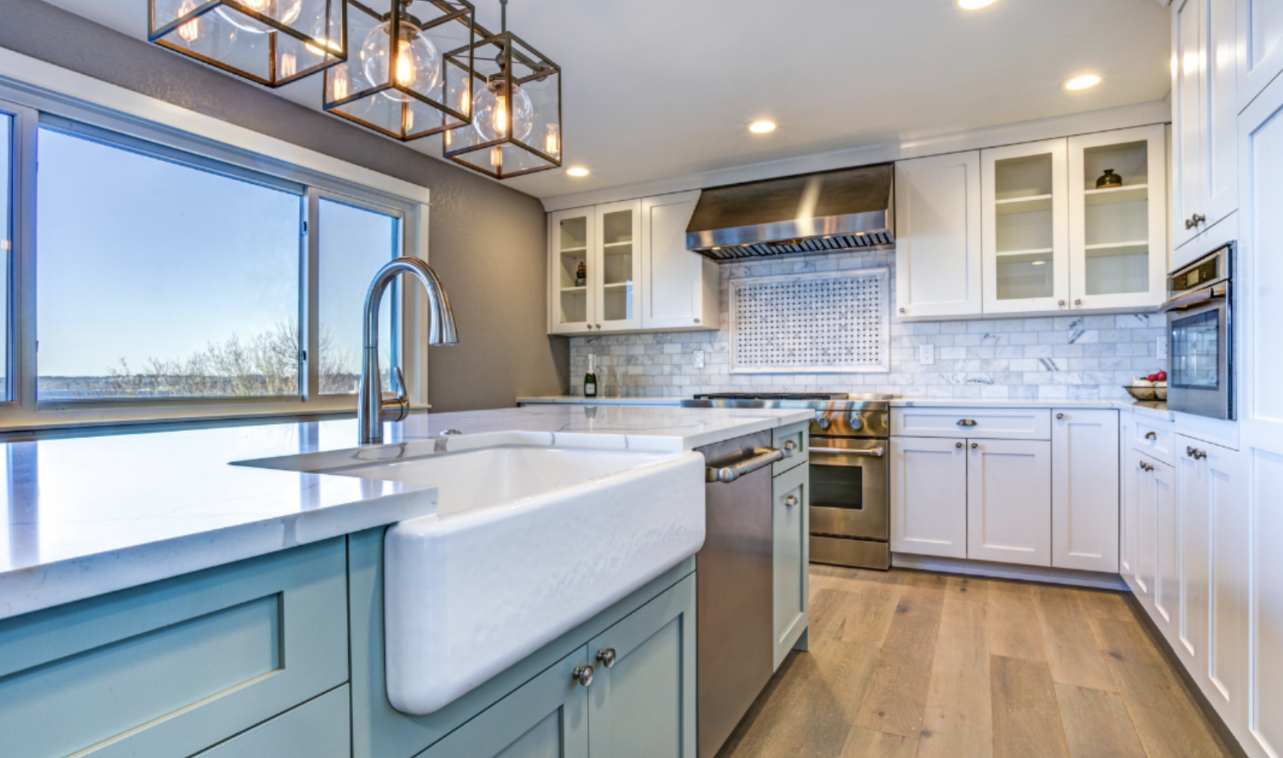
We’ve all been there – we see a paint color we love in a magazine or at a friend’s home and buy that exact color. Once the paint is on the wall, however, it looks very different because the lighting in your home is different than the lighting in the magazine.

To prevent this from happening, work with an interior painting company that has a designer on staff to help you.
Show the designer the photo of what you’re trying to recreate and have them adjust the color to your home’s lighting. This way, the color will end up looking exactly the way you want it to, even if it’s not the exact same color listed in the magazine.
Most people do not see color the way a designer can.
Sure, you might know what colors you like, but you may not be able to recreate that vision once the paint is on the wall. Colors have undertones that can cause what you think is “medium gray” to look “violet” once it’s painted.
Free designer on staff to help you in your home choose colors.
CertaPro Painters offers FREE color consultation for all of our customers. If your painter doesn’t offer this, you can find your own by asking for recommendations and paying for one by the hour. Most charge about 75-$125/hour in the Boston area.
“How can I tell what the paint color will look like after it’s painted?”
Have the painting company do a computer rendering of the space. You can also do one yourself using one of the many apps.
Tiny paint chips are not good enough!

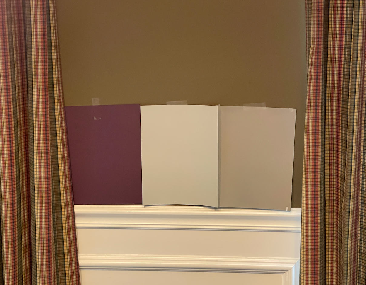
The small paint chips you can get at the hardware store are not large enough for you to get a true sense of the color. What looks like an antique rose can emerge as bubblegum pink once it’s on all four walls.
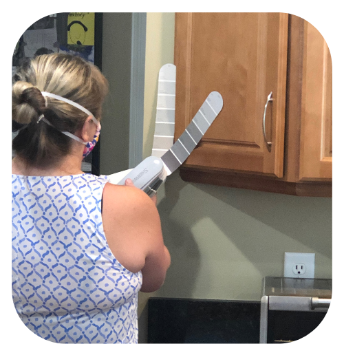
Large paint samples are the way to go. We offer them for free from Benjamin Moore and Sherwin Williams, even if you’re doing the project yourself. Simply email [email protected] with your mailing address and the colors you’d like.
The trouble with painting an open floor plan:
Choosing a color for your interior is made difficult by the fact that many homes have open floor plans, so the paint colors you choose must “flow” together. Often, changing one room’s color has the domino effect of causing the other paint colors on that level to look “off.”
For homes with open floor plans, we recommend working with a designer to choose colors that flow and look nice together. When you’re sitting in your beige kitchen, you shouldn’t be “jarred” by seeing a yellow TV room and grape dining area. A designer can get this 100% right for you.
Consider your room’s purpose to get the right mood:
Different colors evoke different emotions. For example, you might paint a playroom a bright color to energize the space, but that same color might not work in a nursery where you want it calm and dark.
- Blues are calming and can be great for bedrooms or bathrooms.
- Grays and beiges are calming and can be adapted to many areas. They are also great if you’re selling your home and need to ensure the space is universally appealing.
- Yellows are cheerful and might be perfect for a kitchen or breakfast nook.
- Greens can create a serene environment suitable for a den or home office.
Evaluate your lighting:
Rooms with ample natural light will show a paint color in its truest form, while those with limited light could make colors appear darker.
For dimly lit rooms: Consider lighter paint colors
For rooms with bright light: Consider bolder or energizing colors.
Sample paint colors and then live with them for a few days before making a choice. Look at them in the morning and evening to ensure you love your choice in both types of light.
Need free, large color samples? Email [email protected] – we’re happy to send you free large (8 x 10) color samples from Sherwin Williams and Benjamin Moore even if you’re doing the painting yourself.
Ensure your existing furniture and decor match the paint you’re choosing:
 Your current furniture, artwork, and fabrics can serve as inspiration. If your room already has a dominant color scheme, select a paint shade that complements or contrasts with it.
When redecorating, choose your interior paint color last. This way, you can select the fabrics and furnishings first and then match the paint to them. If you choose your paint color first, you will greatly limit the fabrics that will blend nicely with it.
Check Color Undertones
Every paint color has undertones that might not be evident to the amateur. For instance, a gray might have blue or lavender undertones. You think you’re painting your bathroom gray and instead end up with a purplish room. These undertones can significantly affect how the color looks in your space, especially in relation to other colors and furnishings.
Often, we see rooms with walls that are warm and cool cabinets. This makes the room less cohesive and feel “off.”
The best way to get this right is to work with a designer who is trained to see undertones, which the rest of us will only see once they are already painted on a wall. CertaPro offers a free in-home designer who will work with you to get this right.
Consider the paint’s finish:
The finish you choose can affect the paint’s appearance. Matte or flat finishes offer a modern look and hide imperfections but can be less durable. Satin or eggshell finishes are more washable and are great for high-traffic areas. Glossy finishes reflect light and can make a space appear larger.
A word about choosing a color in small rooms:
Small rooms (powder rooms, mudrooms etc.) present a challenge, especially if you’re thinking of painting them a bolder color. Because the walls are so close together, the color will seem bolder than you think when the room is painted.
A few rules of thumb for interior painting for small spaces:
- Light colors expand space: Lighter shades like whites, creams, and pastels can make a small room feel larger and more open. They reflect light better, giving a spacious feeling.
- Optical Illusions with Color: Darker colors on the floor can ground space, and lighter colors on the walls and ceiling can make it feel as if the room’s expanding. Add a mirror and your space looks even more expansive.
- Monochromatic themes work well in small spaces. Using different tones of the same paint color can create a cohesive look and reduce visual overload, making the room feel more unified.


