Psychology of Color in Commercial Painting: How the Right Colors Can Help Your Business Thrive
Posted on October 21, 2024
Did you know that the colors you choose for your business can affect how customers feel and how your employees work? The right colors can make your space more inviting, productive, and even boost sales. At CertaPro Painters®, we understand the importance of color psychology in commercial painting. This means we help you pick colors that not only look great but also influence how people feel in your space. In this article, we’ll go over all you need to know about the psychology of color in commercial painting!

Why Do Colors Matter in Commercial Spaces?
When you choose colors for your commercial property, it’s about more than just looks––though most commercial paint jobs will elevate your business. Colors can uniquely change how people behave. They can make customers feel comfortable or even encourage them to make purchases! The right hue can also help employees stay focused and motivated. The right colors create a positive environment, while the wrong ones can make people feel stressed or uninterested.
That’s why understanding color psychology is so important when starting a commercial painting project. Let’s dive into how different colors work in different business settings.
The Psychology of Common Commercial Colors

Blue: Trust and Focus
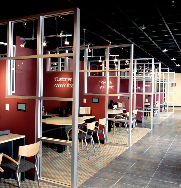
Blue is a calming color. Psychologically, the color helps build trust and encourage focus. It is common in office spaces and healthcare settings for these very reasons! A blue office can help employees stay productive and stress-free, while blue in a medical facility could make patients feel more relaxed.
Example: Financial companies and tech firms use blue to create a sense of trust and reliability with their clients.

Red: Energy and Urgency
On the other side of the color wheel, we have red. Red is a bold and energetic color that grabs attention and can create a sense of urgency. The color works well in gyms, restaurants, and retail spaces. However, too much red can be overwhelming. We recommend using red in smaller amounts.
Example: Fast food chains often use red to increase appetite and encourage customers to make quick decisions.

Neutrals: Professional and Versatile
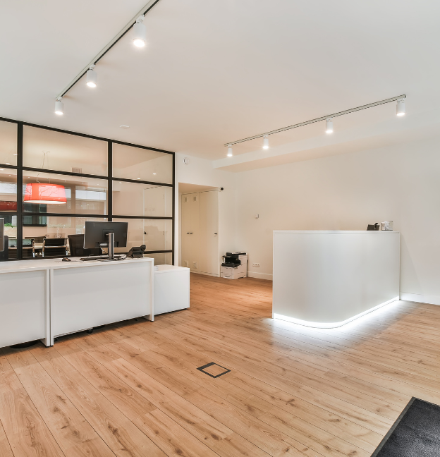
Colors like gray, beige, and white are often used in commercial painting because they are versatile and timeless. A neutral color scheme creates a clean, professional look and can be paired with any accent colors. These shades look especially great in environments such as law firms or real estate offices.
Example: Offices and consulting firms often chose neutral tones to create a calm, focused space that won’t distract from their work.
3 Tips to Choose the Right Commercial Paint Color
Match Your Brand
Choose colors that reflect your brand. This helps create a cohesive look that customers will remember!
Know Your Audience
Different colors appeal to different people. Consider who your main customers are and what feelings you want them to feel.
Hire Professional Commercial Painters
Professional painters, like the team at CertaPro Painters®, ensure your project is done efficiently and with attention to detail like it deserves.
CertaPro Painters® Can Help Enhance Your Business
Whether you want to create a calm office, an exciting retail store, or a welcoming restaurant, using the right colors can make a big difference. Understanding color psychology and working with professional painters will ensure your commercial painting project is a success.
At CertaPro Painters®, we take the guesswork out of choosing the perfect colors for your business. Ready to update your commercial space? Contact us today to learn more about our commercial painting services and how we can help create the perfect environment for your business.


