
We’re Making a Fuss Over Unfussy Beige and Other Neutral Color Trends
Posted on October 28, 2022
Before we start gushing over Unfussy Beige and other beautiful blush neutrals, we know choosing a paint color, in general, can be tough. Sometimes, you know exactly what you’re looking for, but for those times you’re not really sure, you need to turn to an expert to determine what would fit well in a space, which colors will coordinate best with others in the home, and how to create a timeless result you’ll enjoy for years. That’s why hiring a house painter for exterior or interior painting projects is a great way to save time – and ensure you end up with a professional result.
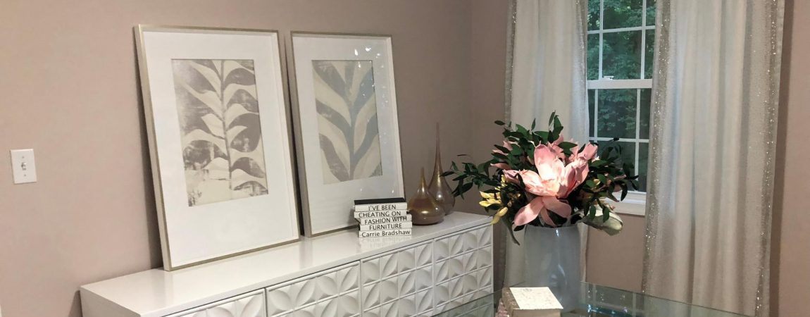
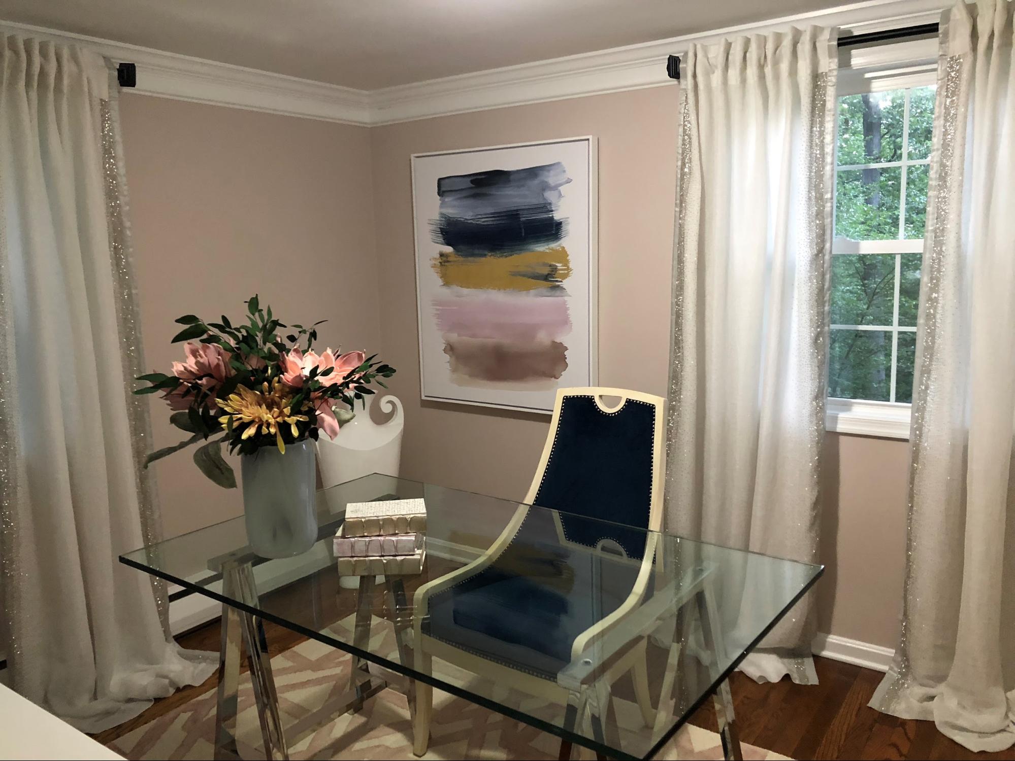
Blush is a paint color family that has been resurfacing in homes once again. Blush is a soft, sheer, neutral color that works well with many other colors and palettes. There’s no limit to where it can be used: living areas, the kitchen, guest bedrooms, children’s bedrooms, the primary bedroom, the basement, hallways, bathrooms, and exterior surfaces. Essentially, a softer look will look great in blush anywhere you want to have a softer look.
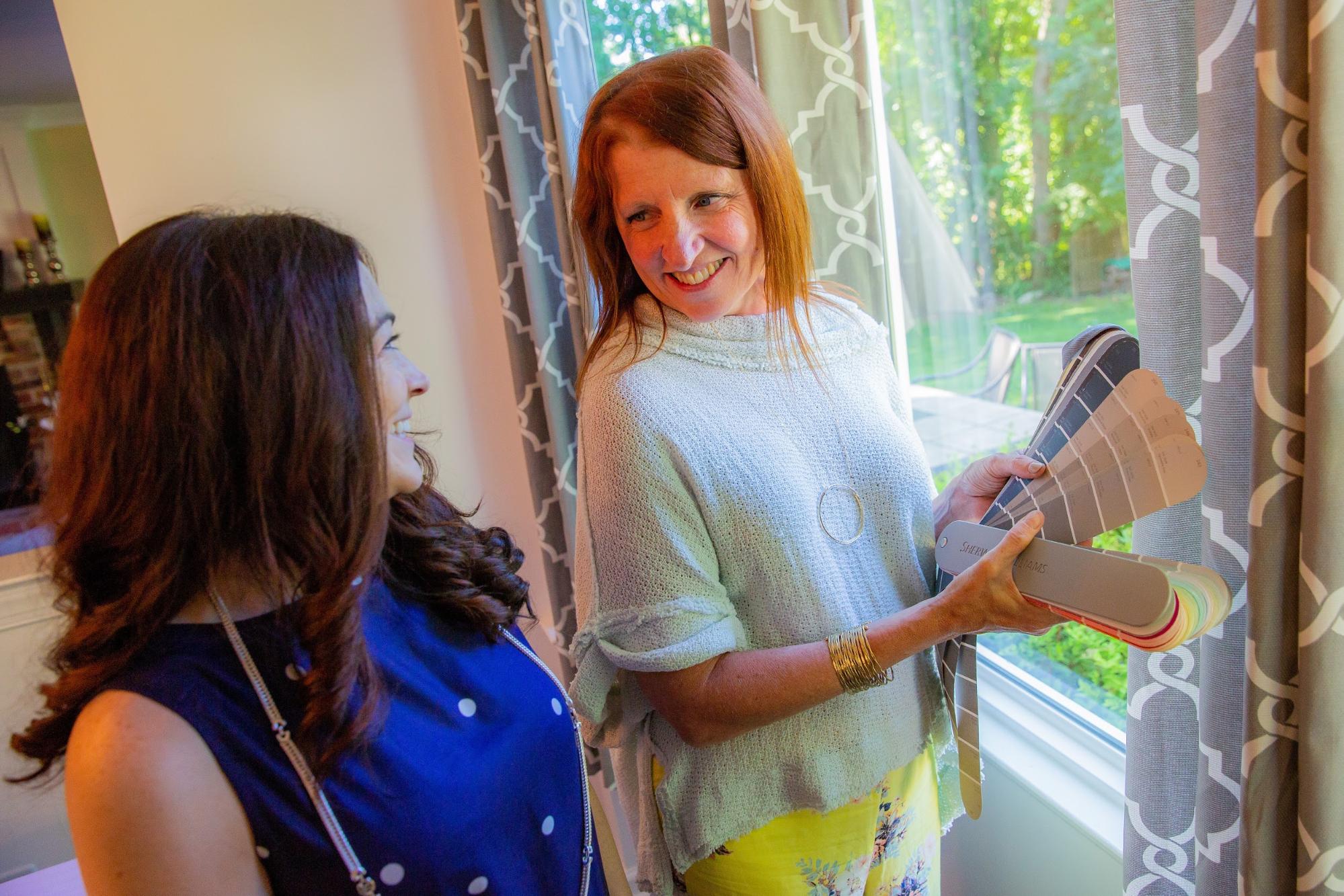
It’s one thing to suggest a color, but you have to know how to use it to get results you’ll love. We asked CertaPro Painters® Interior Design and Color Expert and owner of Beautiful Home, Susan Newcomer, exactly how to get the most out of blush and where it impacts the home.
Q&A with Susan Newcomer About Versatile, Blush Color Trends
CertaPro Painters®: What colors work well with blush shades like Unfussy Beige?
Susan: Blush is a super soft, sheer neutral that works well with a ton of other colors. It looks great with navy, forest green, green apple, coral, lavender and so many more. When you put it with these colors it actually acts as a neutral and tones them down. Not only does blush look great with ample amounts of color, it also works well with our friend, grey. Grey has been used for a while now and it’s not that it’s going away; we are just using it in new ways.
CertaPro Painters®: Grey has been popular for some time. How are you using it now?
Susan: Grey, blush and lots of white look amazing. Blush adds the sparkle to grey in a very soft way – and also keeps it from getting boring!
CertaPro Painters®: It’s interesting to think about combining shades that have previously only been used as neutrals to accentuate other, bolder colors. Why do you think that this trend is becoming popular?
Susan: We’re seeing colors that were once thought of as a garnish or only for powder rooms become suddenly reinvented and repurposed. These colors promote a fresh, young vibe that sets itself completely apart from the look of a few years ago. Color is a fantastic tool that can set the scene for amazing new spaces!
CertaPro Painters®: What would you say about the notion that blush is a “girl’s color”?
Susan: Let’s put an end to that idea. Modern blush is a soft, peaceful tone with a touch of earthiness that will complement many other colors as a neutral. It isn’t masculine or feminine; it is just neutral and can be perfect for any person and any room or outside living area.
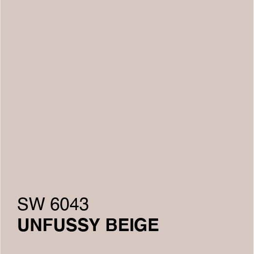
Afraid of Blush Looking Too Pink? Try Unfussy Beige And Intimate White
At CertaPro Painters®, we’re loving these two blush shades from Sherwin Williams, Unfussy Beige and Intimate White. These can be used in any room of your home to complement and highlight the shades you might already be using as accent pieces. They can also be used on the exterior of your home with virtually any color accessories like shutters, doors, and molding.
Imagine the possibilities of these color combinations:
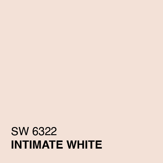
Intimate White (SW 6322) with Jade Dragon (SW 9129) or Tempe Star (SW 6229) in a guest room for a rich look in a palette that any of your overnight visitors will enjoy.
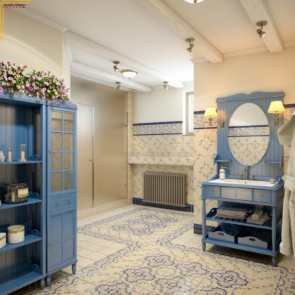
Unfussy Beige with Wishful Blue (SW 6813) or Tidewater (SW 6477) in a bathroom allows for a soft look.
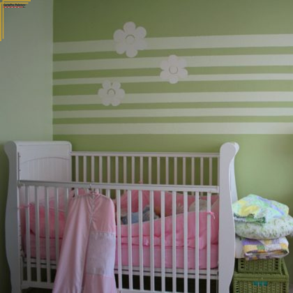
Intimate White with Youthful Coral (SW 9004) or Agate Green (SW 7742) for a unique look in the nursery when you want to avoid pastel blue and pink.
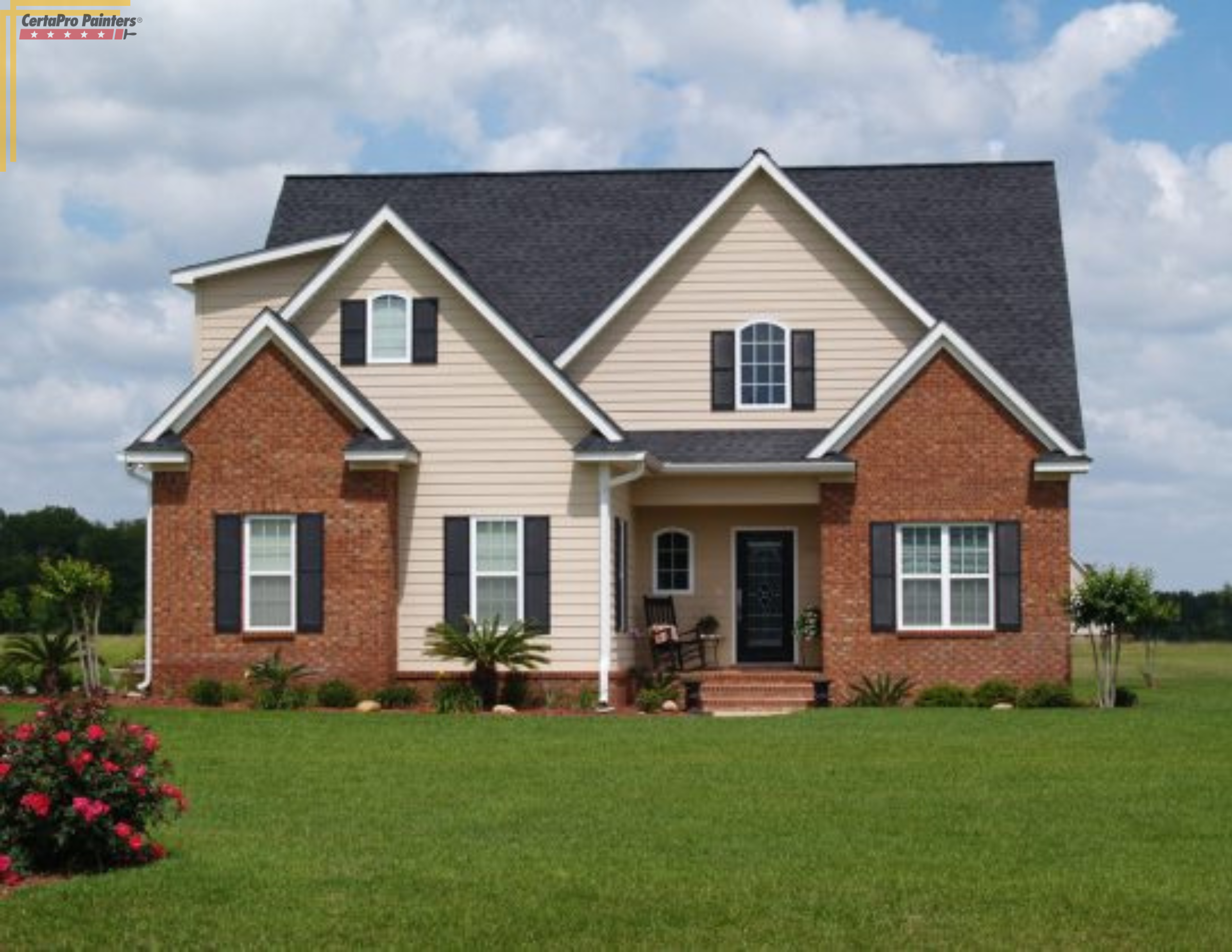
Unfussy Beige with white, gray, or black shutters on the exterior of your home for a sharp look that will look amazing next to your neighbors’ homes, no matter which colors they choose.
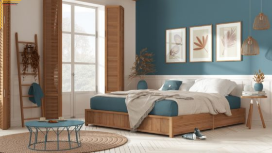
- Unfussy Beige with Downing Slate (SW 2819) and High Reflective White (SW 7757) to accentuate a high-end primary bedroom with white furniture and black or gray linens.
- Intimate White with a Roycroft Copper Red (SW 2839) or Smoky Blue (SW 7604) in the front lobby of your business property to greet visitors and employees with a calm, strong palette.
Our color experts are happy to work with you to develop the perfect color scheme for your home or place of business.
Contact CertaPro Painters® For A Free Consultation
Looking to upgrade your space with a beautiful, blush neutral? Choosing the right color scheme for your home, exterior living areas, or even your place of business can be difficult. So we offer a free consultation with a CertaPro Painters® professional as well as color consultation services to ensure you’re getting a color you love.
Contact us today to learn more about our services and to see the various palettes we have that can create the atmosphere you have been seeking.
