And The Winner of the CertaPro Painters Color Bracket Challenge Is…
Posted on May 31, 2019
- We put some of this year’s top colors head-to-head and asked our Facebook fans to vote for their favorite.
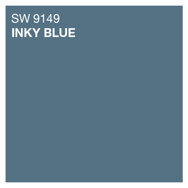
- The winner of the first CertaPro Painters®Color Bracket Challenge was Inky Blue by Sherwin Williams!
- We can certainly tell why––it’s a cool blue paint color that is versatile for an interior or exterior home painting project, and has a modern flair that easily pairs up well with other trending colors.
We recently asked our Facebook fans to help us out with our first CertaPro Painters® Color Bracket Challenge. The votes are in and *drumroll please*…Inky Blue by Sherwin Williams came out on top! It was a close head-to-head between some fierce competition. (Let’s show a little love for our runner-up, Parisian Patina, also by Sherwin Williams.)
Before we celebrate our winner, we’d like to thank everyone who voted. If you haven’t already, head on over to the CertaPro Painters Facebook page and follow us! By doing so you’ll be able to keep up with future contests, get painting advice ahead of your next professional painting project, and read the latest news on color trends so you can stay in-the-loop!

All About Our Winner
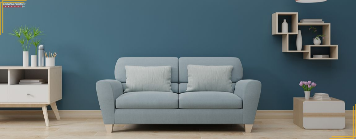
Inky Blue is a crowd-pleaser, for sure. It’s a cool blue color that gives off a subtle tint of gray, making it an agreeable paint color to build a color palette around. Blues and indigos have made their way to the top of the interior design charts this year. There has been a lot of love given to bold blues because of their ability to make a clean statement while evoking all those seaside feelings that put you in a great mood. The Inky Blue color falls right in line with this trend. It can be both calming and exciting depending on complementary colors it’s paired with and the style of your interior or exterior space.
Inky Blue is one of those paint colors that can work tremendously for both your interior and exterior professional painting project. In a traditional-style home, Inky Blue paint color would look great with bright whites, earthy beiges and cool grays. Vibrant oranges, yellows, and greens can also play to Inky Blue’s strengths to fill out a color palette for a more modern and eclectic home.
“In addition to being fabulously trendy, Inky Blue can also be considered a classic,” says color expert Susan Newcomer of Beautiful Home, CertaPro Painters® Interior Design. “It’s not quite navy, but it’s on par and employs a happy, energized response.”
I don’t know about you, but we’re feeling Inky Blue. We totally can see why it made it through round after round to become the bracket challenge champion. It plays along nicely with interior design styles of all types, is simple to work into existing color palettes, and can even hold its own on a home’s exterior.
Keep reading to learn how Inky Blue can work in your next professional painting project.
Inky Blue For Your Home’s Interior
If you’re looking to build a neutral color palette around Sherwin Williams’ Inky Blue, we love it paired with these coordinating colors, also from Sherwin Williams: Icicle (SW 6238), Natural Linen (SW 9109), and Cocoa Whip (SW 9109). They work together to make a cozy palette that would be great for a living room or den. With that neutral color scheme, you can introduce fun pops of primary colors like a yellow statement chair or red couch pillows to round out your design.
Inky Blue is great for creating a serene space. You can use the color alongside an off-white and pastel pink for a primary bedroom or bathroom that you want to be calming. We love Flexible Gray (SW 6010) with Inky Blue. Flexible Gray is part of Sherwin Williams Sophisticated Sanctuary line. It’s a bit rosey with a nice subtle warmth that makes it great for cozy spaces.
“I also love Inky Blue with one of my new favorites, Sherwin Williams’ Gorgeous White. It is very fresh and different,” says color expert Susan Newcomer of Beautiful Home, CertaPro Painters® Interior Design.
Inky Blue feels right at home in a cool, chic office space when paired up with neutrals like Dorian Gray (SW 7071), Studio Mauve (SW 0062), Comfort Gray (SW 6205), Smart White (6007), and an accent color like Golden Fleece (SW 6388). Orange and blue have always been such a modern color combination, which is why we love when Inky Blue and Golden Fleece team up.
Orange colors are intense and dramatic, while blue colors are relaxing and pleasant. They harmonize together to make for an energetic space. This color palette would be especially pleasing in a trendy mid-century-modern-style interior. Marigold (SW 664) would also be an excellent orange for the project!
Our bracket challenge winner is an obvious pick for those looking to embrace a nautical theme for their professional painting project. Nautical interior design is usually built around a strong blue and white color palette that can make you feel like the sea is just outside your door. Inky Blue is a smart bet to bring that beachy feeling into your home. Take a look at the light blue color Meditative (SW 6227), a navy blue color called In the Navy (SW 9178) and a white color called Pure White (SW 7005) to add to your seaside color palette along with Inky Blue.
Bringing Blue to the Exterior
Having your home’s exterior painted a fresh color scheme is no small project, which is why you want to make sure your color selection is spot on and your colors are expertly applied by a team of professionals who know how to prep and protect every surface of your home.
Your home’s exterior will typically consist of three color selections: the body, accent, and trim. We adore Inky Blue as an accent color for a professional exterior painting project. It’s so friendly and welcoming to be the pop of color your home needs to up your curb appeal. Consider Inky Blue for your shutters or front door with a neutral for your home’s primary body color like Sherwin Williams Natural Linen (SW 9109), Marshmallow (SW 7001), or Roycroft Mist Gray (SW 2844).
If you love Inky Blue enough to make it your home’s primary body color, consider using a clean white for the trim with either a red, orange, or yellow as an accent color. Inky Blue with a daring Red Tomato (SW 6607) door? Yes, please! Homes that choose blue for a large portion of their exterior exude a nautical spirit or sense of Americana. Red brick patios are especially screaming for a blue exterior. The combination is darling.
Remember, if you’re having trouble deciding between colors right now, you don’t have to go as far as creating your own bracket challenge for your Facebook friends to choose your color fate. CertaPro Painters® has color consultants that can help you work through the color selection process so you feel comfortable with the color palette your team of professional painters will bring to life. Call 1-800-689-7271 today to schedule a free estimate, or contact us online to get your project started!
This One’s For All of Hue
It wouldn’t be right if we didn’t acknowledge all the colors that fought it out in our eight-round CertaPro Painters® Color Bracket Challenge. All of the following Sherwin Williams colors receive a special honorable mention in our book. Better luck next time!
- Decisive Yellow (SW 6902) brought some major sunflower feels to the competition.
- Keystone Gray (SW 7504) was a sophisticated contender.
- Novel Lilac (SW 6836) is just as beautiful as its namesake.
- Parisian Patina (SW 9041) was close to taking the top prize!
- Show Stopper (SW 7588) is a vibrant red that lives up to its name.
- Stone Lion (SW 7507) is a flattering warm neutral.
- Teaberry (SW 6561) had us tickled pink.
Thanks again for voting, and remember to give us a follow on Facebook to participate next time in our CertaPro Painters® Color Bracket Challenge!


