Unveiling the Best Paint Colors for Modern Healthcare Facilities
Posted on August 30, 2024
Your healthcare facility is not just a place where medical treatments are administered; it’s also an environment where both physical and psychological healing occur. The colors on the walls are more than just decor—they’re therapeutic tools that can help foster a more comfortable and healing environment for patients.
Why the Right Color Matters
When a patient steps into your healthcare facility, their emotional state varies, from anxious to hopeful. Choosing the right paint color can make an immediate impact on how they feel. From the lobby to patient rooms, color has the power to calm, soothe, or energize, impacting not just patient satisfaction but also their overall healing process.
Introducing Anthology: Volume One by Sherwin-Williams
Our new biennial trend report from Sherwin-Williams, Anthology: Volume One, offers a curated palette featuring colors like SW7004 Snowbound, SW6139 Mossy Gold, and SW9091 Half Caff. These shades are specifically chosen to reflect contemporary shifts in color trends, offering choices that can enhance your facility’s ambiance.

The Power of Neutrals
For instance, consider using SW7004 Snowbound for a neutral backdrop that can serve multiple functions, from patient rooms to waiting areas.
Incorporating colors from nature into a dentists’ office or hospital walls can mimic these scenes to promote restfulness, lower heart rate, and ultimately, help a patient heal more quickly.
The Science Behind Colors

The Emotional Impact
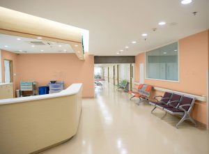
Colors trigger a wide range of emotions and responses. For example, SW6352 Soft Apricot has a calming effect and can lower blood pressure, making it a good choice for patient rooms and waiting areas.
Earth Tones
For invigorating spaces, SW6139 Mossy Gold can elevate energy levels and bring in a touch of nature, which could be useful in areas like physical therapy centers.
Stress and Its Detrimental Effects
The American Psychological Association highlights the detrimental impact of stress on health. An environment painted with calming colors like SW6051 Sashay Sand can mitigate stress levels, potentially improving patient outcomes and reducing the length of hospital stays.

Sophisticated Tones
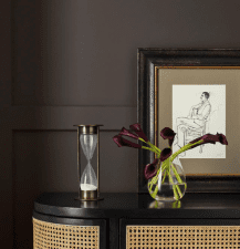
If you’re looking to introduce an air of sophistication in administrative or managerial offices, consider using deep shades like SW7675 Sealskin for powerful contrast and a sense of gravity.
Biophilic Design in Healthcare
The concept of Biophilic Design has proven benefits for healthcare facilities. Using nature-inspired colors like SW9091 Half Caff can mimic outdoor settings, promoting a sense of peace and overall well-being.
Practical Tips for Choosing the Right Color
- Assess the Space’s Purpose: Different rooms serve different functions. Colors like SW6352 Soft Apricot can work well in calming spaces, while SW6139 Mossy Gold is great for invigorating areas.
- Existing Design Elements: Consider existing aspects like flooring, furniture, and lighting. Your new wall color should complement them.
- Brand Consistency: Keep your brand’s colors in mind. Consistency in branding helps build trust.
- Expert Consultation: Organizations offer color consultation services that allow you to preview different color schemes virtually.
Conclusion
Choosing the right paint colors for your healthcare facility is a critical aspect of patient care. Using a well-designed color scheme, informed by expert recommendations like those found in Anthology: Volume One by Sherwin-Williams, can reduce stress, improve patient satisfaction, and even promote quicker healing.


