Connect Your Home With a Cohesive Paint Color Story
Posted on May 8, 2019
- Do you ever get house envy from someone’s space that just feels like the paint color was ever so thoughtful and put together in every single room?
- Your home can achieve that same effortless flow with a professional interior painting project.
- Think of your home as its own design scheme––every room should feel like it plays a role in telling your home’s larger story.
Do you ever find yourself wandering around someone else’s home with admiration wondering how they’ve gotten it to feel so unified and cozy? They’ve achieved a look where every room serves its own unique purpose, but feels like it fits under the same aestheic umbrella. There’s just something about it––it just feels right. What do these homes have that yours is lacking?
They have a flow of color. Cohesiveness. Unity. Color harmony. A consistent vibe between connecting rooms. Whatever you want to call it, that “thing” is that their home feels finished and thoughtful.
Unlocking that cohesive flow throughout a home can be difficult to achieve, especially if you love color. A new bold or bright color in every room can make a home feel choppy or disjointed. On the flip-side, too many neutrals throughout the home may not be expressive enough for someone who loves to show their personality with color.
Most people only focus on one room when thinking about a professional interior painting project. Maybe one month you’ll focus on the downstairs kitchen. Once that’s been transformed, it time to direct your attention upstairs to the primary suite and guest bedroom. Instead of starting with a blank slate each time you think about a room in your home, create a whole-home plan.
Are you overwhelmed at the thought of that? Don’t be. Yes, this approach means you’ll have to do a bit more planning upfront, but it actually makes the process so much easier when you can wrap your head around the big picture. The payoff is worth it too!
You’re not in it alone. The team at CertaPro Painters® would love to color consult and conceptualize with you on a complete interior painting project. You may only be interested in having one section of your home painted right now, and that’s OK. You can still think through how the remainder of the home will fit into whatever color story you choose and have it completed at a later time. Being able to envision the complete transformation can even help you stay motivated to see it through to the end!
It’s a bit like creating design guidelines for your home. Consider it your primary mood board. Every time you add on a new interior painting project or even go shopping for some new home decor, you have a little guide to make sure your choice falls in line with the aesthetic goals you’ve set for your home. This plan could be as simple as a folder of color swatches that you’d like to act as your primary color scheme or as detailed as a Pinterest board full of design and color inspiration. It’s all about staying organized in the best way that helps your brain imagine the big picture of your home’s color story.
Things Don’t Have to be Identical
Don’t think that creating a primary color plan for your home means that every room in your home’s interior needs to be the same color. Creating a cohesive color story just means that you’ll be selecting a core color palette that will appear consistently throughout your home. With the help of a professional CertaPro Painters® color consultant, you can build that palette to guide your color selection. Each room will use one or a couple of the colors from that palette. Then, you can bring in unique accent colors in individual rooms that add a bit of unique flavor room-to-room.
“Using different colors in a room is fine but be sure to pick a color that is considered the main color of the design scheme. Use this color consistently throughout the connecting rooms,” says Stephen Buttrick, owner of CertaPro Painters® of Needham, MA.” You can incorporate other colors as accent colors but limiting these will keep that cohesive feel you’re looking for.”
One Big Happy Family
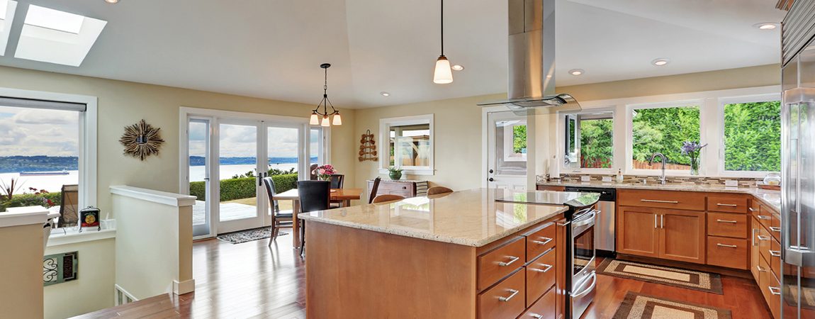
Open plans color schemes are a fantastic opportunity to lay a foundation for a cohesive color story. For example, if your dining room is already flowing right into your kitchen with no doors or dividers, this is the perfect place to select a color that will transition between rooms, making them work together as one. Paint the largest, longest wall the same color in these spaces with the supporting walls a complementary color. That way, the eye is drawn along that wall all the way through the home.
If the floor plan is not completely open, you could also choose colors that are part of the same family, but have slightly different intensities, or degrees of brightness. For example, Luxe Blue (SW 6537) by Sherwin-Williams would make a fantastic living room wall with Rarified Air (SW 6525) in an adjoining kitchen or dining room. They’re both blues, but the latter is a much lighter and subtler hue. Play within the same color family but differ the hues enough so that each space still maintains its own identity and creates a seamless paint transition from room to room. Pulling from the same family of colors will help you establish that common thread within your palette to create harmony as you travel through your home.
Remember Your Sightlines
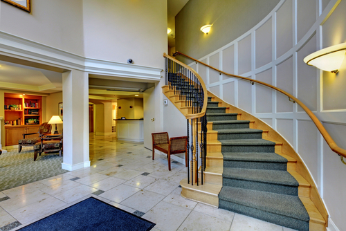
Choose a room and stand in the center of it and do a 360 spin around. What other surfaces can you see? Is a kitchen wall visible from your living room? How about a hallway when your bedroom door is open? Those visible areas into other spaces are called sightlines, and you should take them into consideration when designing. Those spaces should work together well with the room in which they’re visible.
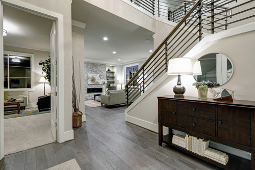
A good example is the entrance of your home or your hallways that lead into adjoining bedrooms. The color scheme should flow nicely between these surfaces and the adjacent colors connect to.
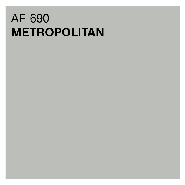
Neutrals are good for hallways and foyers. Neutrals don’t necessarily have to be white. You can simply select a very light hue of whatever color the primary room has on its walls. Also, you can find a neutral that has the same undertones as the room color it leads into. For example, Metropolitan (AF 690) by Benjamin Moore is a stylish gray that has cool undertones, meaning that it would complement a blue, green or purple room. A color like Shaker Beige (HC 64) has warm undertones that would pair well as a hallway outside of a room that is painted with a red, orange, or yellow hue. Staying within either a warm or cool color scheme is another trick to making sure your house maintains a comfortable flow.
You Can Still Have Some Edge
We’re not telling you that you have to always play within the rules of your primary color plan. Indulge in that unexpected, bold color you’ve had your sights set on, but select it for a room that is out of the sightline of other rooms. Everyone loves that “wow, I wasn’t expecting that” reaction. A well-placed bold move with color selection can always be a fun statement room in your home that’s off the beaten path of your home’s design guidelines.
It’s best to place this “wow” color in a room that is encapsulated by four walls and a door. Think of it as your little secret––not because you want it hidden, but because you don’t want it to interrupt the flow of the other rooms. If you have a little powder room, primary bedroom accent wall or basement zone that is closed off from the rest of the home that you want to have a completely different vibe, go for it!
Decor Should Be Part of the Plan
After you have your home’s interior professionally painted, it’s time to have some fun with the details. This is where your skillfully applied paint project can really come to life and become part of a dynamic design. In the same way you thought to unify colors for your home’s interior walls, you’ll want to have the same exact thought process when selecting fabrics and decor.
If you prominently featured a red hue in your living room, think of how you can add little pops of that color in adjoining rooms. It can be something as simple as adding a few touches of red in artwork, curtains or accent pieces of furniture throughout your home. Inserting the colors from your palette in other textures of your home beyond its walls will make for a well-rounded and thoughtful design execution.
It’s natural to feel a little overwhelmed with the idea of thinking of your home as an entire blank canvas to build a color story around. The team at CertaPro Painters® would be happy to lend their expertise to pull it all off for you seamlessly! Get in touch with today at 1-800-689-7271 or schedule online to get a free estimate.


