Paint Fresh New Colors that Will Give Your Home a Rejuvenated Look and Feel
Posted on August 7, 2017
If you’re looking to create a little more depth and appeal to your living spaces, opting for a two-tone approach to your interior paint colors can be an effective way to do so. Choosing fresh colors that complement one another can completely rejuvenate a room and wake up your home. Determining good color combinations will largely pay off in your home makeover.
Choosing two or more new paint colors for a room can seem challenging, but there’s a stress-free way to make the best choices. Designers depend on the ‘Color Wheel’ all the time, and so can you. Read on for more information about the color wheel and how you can use it to determine which paint colors will look best together, whether you’re renovating your home or just doing some redecorating.
How to Use the Color Wheel

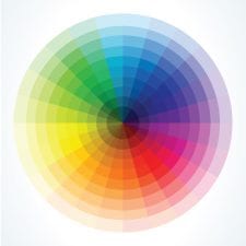
The color wheel is a visual representation of the full color spectrum.
There are three primary colors (red, yellow, and blue), three secondary colors made from the primaries (orange, green, and violet) and six tertiary colors that bridge the gaps (yellow-green, yellow-orange, orange-red, red-violet, blue-violet, and green-blue). On the color wheel, the colors relate to each other, blending harmoniously from one color to another and moving seamlessly between warm and cool hues
Understanding these paint color relationships can help you choose pleasing color combinations for your home.
Monochromatic colors
The simplest combination includes tints and shades of the same color. Think of it as using a light blue alongside a slightly darker light blue. Generally, the closer to monochromatic a room is, the calmer the room will feel.
One common example of this is a bathroom painted teal and a lighter shade of teal, such as Benjamin Moore’s Santa Clara 753 alongside Benjamin Moore’s How Blue Am I? 752. This pleasant combination is serene and inviting, and can provide a perfect bathroom setting that is ideal for relaxing.

Analogous colors
These colors lie next to each other or near each other in even steps. They’re different enough to spice up a room, but still blend well together. Colors such as red and orange provide a pleasing variation in color without the more striking difference created by complementary colors.
For an analogous color scheme, try out greens and green blues in a bedroom for a rich, luxurious feel. One room color idea is using the following three colors – Benjamin Moore’s Erin Green 608, Benjamin Moore’s New York State of Mind 805, and Benjamin Moore’s Varsity Blues 756 – for a beautiful combination.
Complementary colors
Opposite each other on the color wheel, complementary colors attract attention in a somewhat bolder but pleasing way.
For example, a living room with two starkly different colors creates an interesting look, and can be easy to achieve. Pairings involve the three primary color combinations: red and green, yellow and violet, and blue and orange. Pairings can be used in a range of intensities, from pastels to bold.
One popular complementary color pairing is a red-orange hue, such as Sherwin-Williams Hearty Orange SW6622 against a light blue-green, like Sherwin-Williams Mariner SW6766. Try this method out by using one as the main color and the other as an accent.
Improve a Large Window View
Large bay windows expand views, let in lots of natural light, and serve as a focal point for most rooms they’re located in. When decorating a room with a fabulous view, it’s best not to compete with Mother Nature. Let the window serve as a center of interest, as a guest’s eyes will be naturally drawn to it anyway.
One option for painting a room with a large window is to use nature-inspired neutral paint colors to frame the scene, at least on the wall with the largest windows. If the window looks out to a lot of trees and grass, you probably want to avoid doing a shade of green close to the grass color. Very light blues, darker beiges, cool grays, or tans look beautiful without clashing with the view.
Opt for a Single Bold Accent Color
When using three or more paint colors in a room, you’ll achieve the best design balance if only one color is very bold. Paint one wall or one area of the room with the bright or unique paint color, while the surrounding walls or areas are more muted or neutral.
The vibrancy of this accent color will catch the eye, and its uniqueness will be more beautiful without having to compete with other colors. If a room is painted in several different bright colors, it could make you and your guests feel overwhelmed. And because neutrals usually have undertones of yellow, green, blue or even red, they’re useful companions to other paint colors you might use in a room.
By understanding the color wheel, and having these general rules of thumb, you should be prepared to choose different paint colors that look beautiful next to each other and improve the look and feel of your space.
If you’re still not confident in your own paint choices, the experts at CertaPro Painters® can help. With their Color Consultation and Painting Services, you’ll meet with a professional color consultant who will assist you in choosing the perfect color for your space, whether the painting project is interior or exterior. And the CertaPro Painters® MyPaint Colors™ visualizer allows you to virtually paint the exterior of your home, so you’ll know exactly which colors to pick.
And when you are ready to paint, our CertaPro Painters® team would be happy to execute a professional painting refresh for your home. Call 1-800-689-7271 or schedule a free estimate online to get started!


