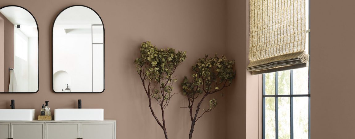
Sherwin-Williams recently announced their 2023 Color of the Year! Introducing: Redend Point!
Posted on December 7, 2022
An intriguing hue of blush beige, Redend Point gives us a soft, nature-inspired canvas to highlight bold accents or bring warmth and comfort to a calming space. We at CertaPro Painters® are excited to incorporate this beautiful shade into our customers’ interior painting projects.
Let’s dig deeper into Sherwin-Williams’ Redend Point and how to incorporate this color of the year into your home.
Nature Always Wins
We’ve seen many nature-inspired home design trends this past year heading into 2023. The lineup for 2022 palettes were various shades of greens, like Sherwin-Williams’ Evergreen Fog, which paid tribute to nature’s calming hues.
Sue Wadden, Director of Color Marketing at Sherwin-Williams, speaks to the trend in home interior color palettes.
“We wanted the 2023 Color of the Year to reflect what we’ve been seeing in terms of neutrals warming up. Homeowners are opting for warmer whites, beiges, pinks, and browns. Redend Point SW 9081 is an earthy color, and its subtle pink undertones exude a feeling of warmth and exploration—something people want to feel in their homes. It also leans into the macro trends we’re seeing around empathy and care culture. While self-care is incredibly important, care is also about looking out for each other and our communities.”
Nature has a lot to offer in terms of inspiration, so this onward trend of incorporating all of those stunning color schemes into our homes is one that will be sticking around for a while.
All About Redend Point
A member of the beige family, Redend Point is an uncomplicated neutral that offers a ton of versatility. Playing off its pink hues, pair this warm neutral with other pinks or romantic colors. Or create a warm, calm area by combining Redend Point with darker earth tones and natural textures.
According to Sherwin-Williams, Redend point evokes a sense of “connection with the world around us” and transforms spaces into intriguingly minimal, calm environments.
If softer spaces and flexibility are in your home design goals, Redend Point is a smart choice.
Redend Point in Action
We love the color, but how do we incorporate it into our homes? Below we’ll offer tips and inspiration for how to get this minimal yet cozy color into your space.
In the Living Room
Our homes are our sanctuaries and should feel as such. As much time as we spend in our living rooms, it should provide a sense of calm and be inviting for our guests.
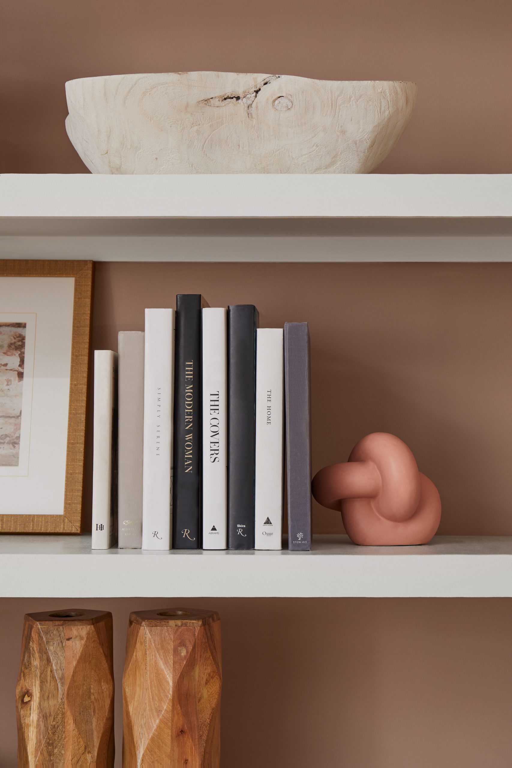
Redend Point is the perfect foundation for a cohesive color palette. Its minimal essence with a touch of pink gives us the ideal calming neutral to cultivate an environment perfect for cuddling up on the couch or enjoying a cup of coffee or glass of wine with close friends.
In the Bedroom
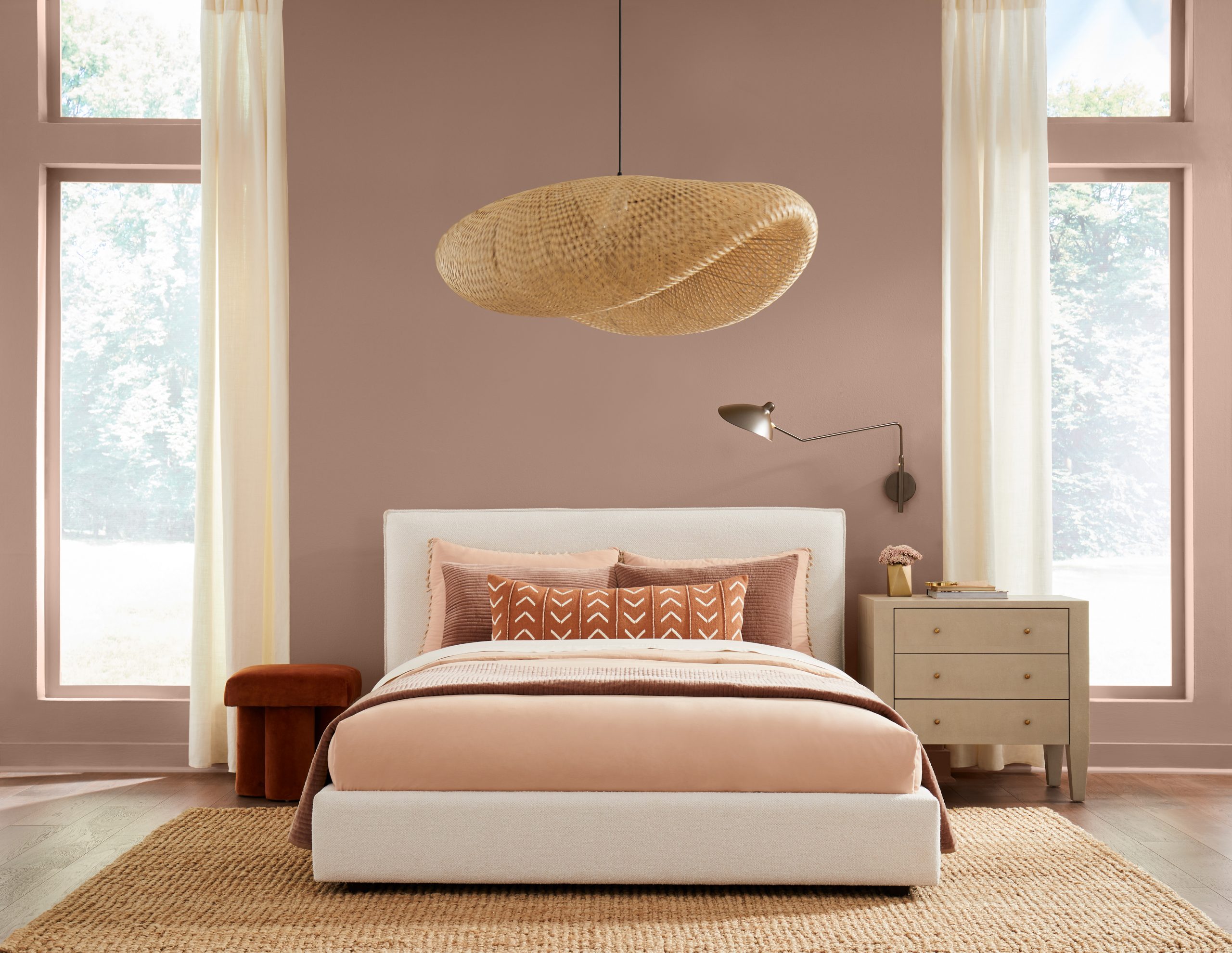
Redend Point in the bedroom is a great choice for those east coast, coastal themes and rich textured, nature-inspired decor. This soulful hue can be incorporated into most decor or styles as long as the feeling you’re going for is calm comfort. It gives versatility to let you rely on your wall color or to compliment bold accent pieces as you need it to.
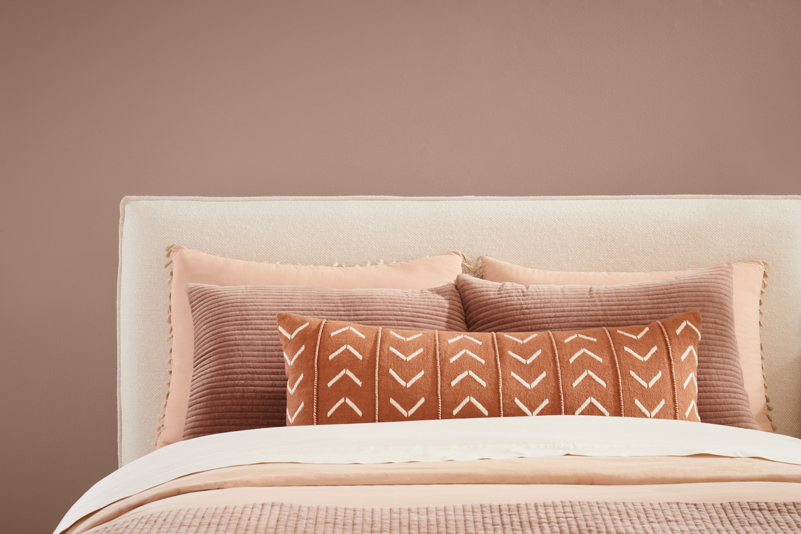
Painting your bedroom walls with Redend Point will make you feel like you’re being wrapped in a cozy blanket every time you retire into your space while offering a lightness like a white neutral.
In the Kitchen
We’re used to hearing that kitchen cabinets should only be white or stained. The general rule has always been to play it safe in the kitchen. Don’t be too bold, don’t go too dark. Kitchens are typically thought of as the heart of the home, and they should reflect the homeowners and their personalities.
Redend Point is not off-putting, it will give your cozy kitchen a sense of intrigue. A neutral, after all, this warm blush beige creates an inviting environment to cook meals with your family and friends or have meaningful conversations with loved ones.
As an Accent
Carefully curated color palettes are one of our favorite things to do at CertaPro Painters®. We understand that sometimes, less is more, and with Redend Point, that’s exactly what you can expect.
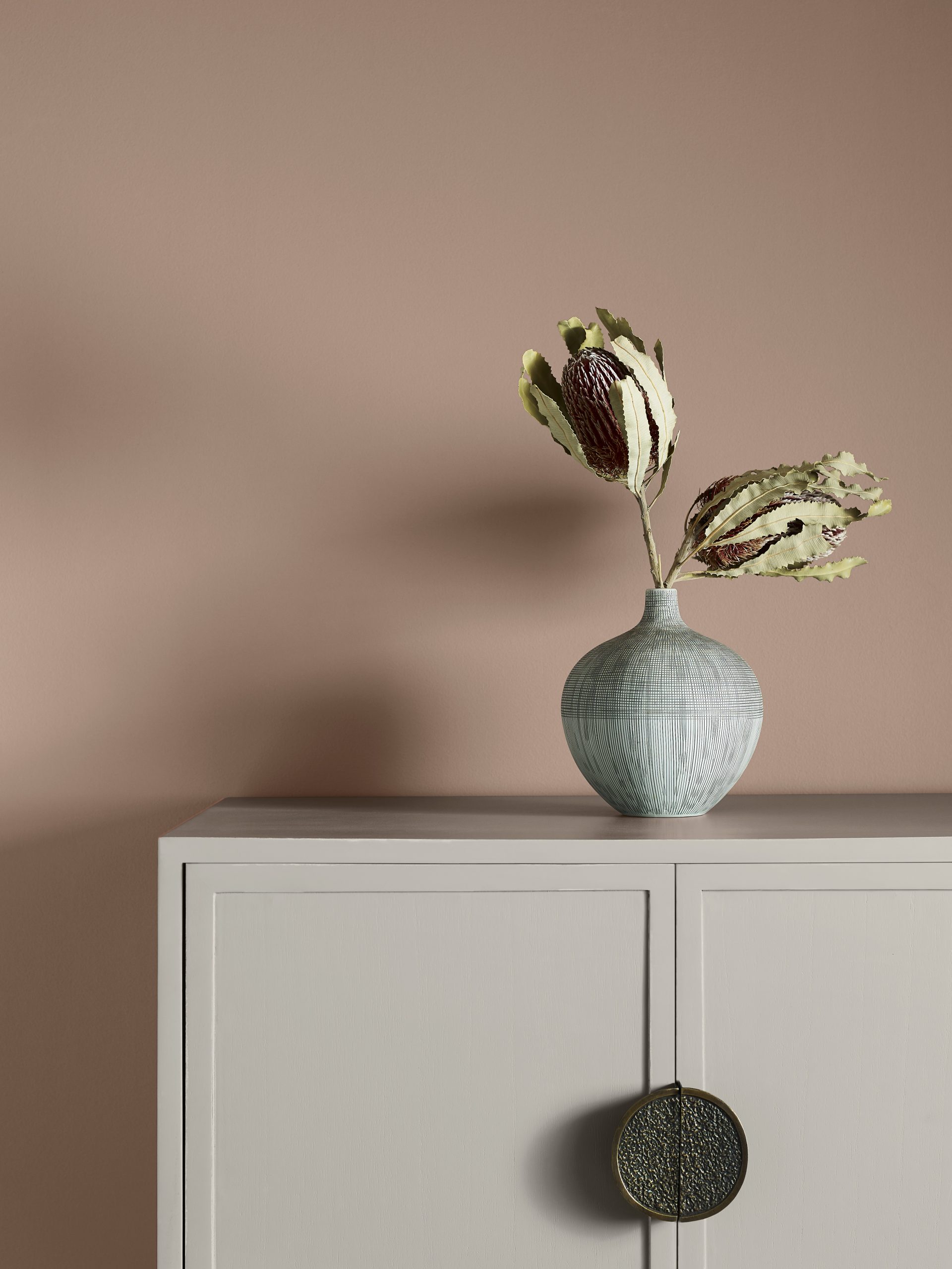
We love Redend Point’s ability to seamlessly tie a room together and provide a bold pop of color when used sparingly. Whether an entryway, a bookcase, an end table or a coffee table, Sherwin-Williams’ Redend Point will bring the power of neutrals and calming nature of pink-based paints to any space.
The Hidden Super Powers of Neutrals
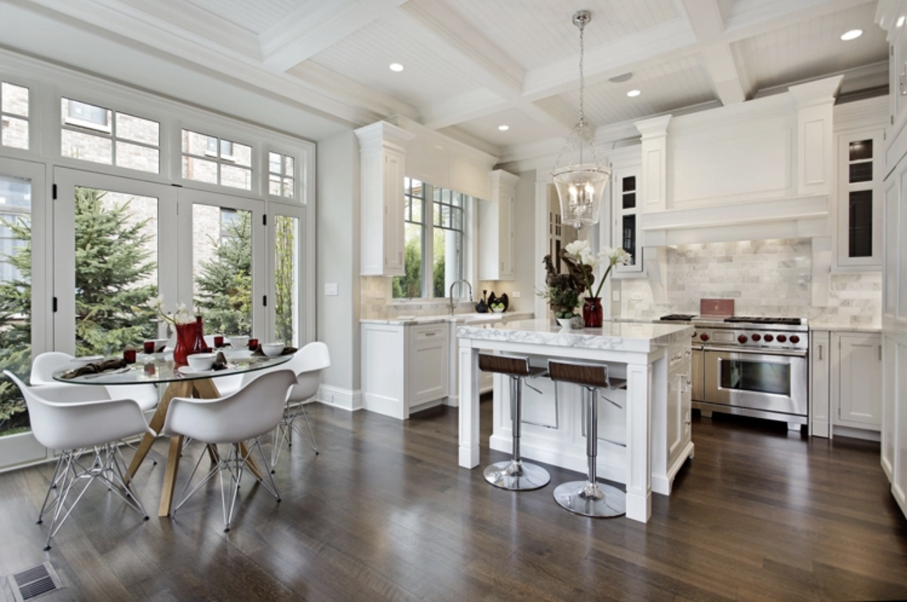
Neutrals, like Unfussy Beige, tell us you don’t have to be a bright orange or loud pink to make an impact in a home. The power of neutrals is that they provide a strong foundation for creating the ideal space and environment that can adapt and change as your tastes do.
You cannot go wrong with a neutral color palette, giving you the flexibility to be as creative as you want with your decor while also giving you enough depth to let them do the heavy lifting.
Are you Blushing? Get Redend Point in your home with CertaPro Painters®
We hope we got you as excited as we are to try out Redend Point, Sherwin-Williams Color of the Year for 2023! Consider incorporating this soulful hue into your home for a trendy, calming, powerful start to the new year.
Trust the professionals at CertaPro Painters® of San Francisco for a flawless finish and extra support with our color consultation services. Contact us today for an online estimate on your next painting project!


