
It’s Time to Get a Clue About Hue
Posted on January 21, 2022


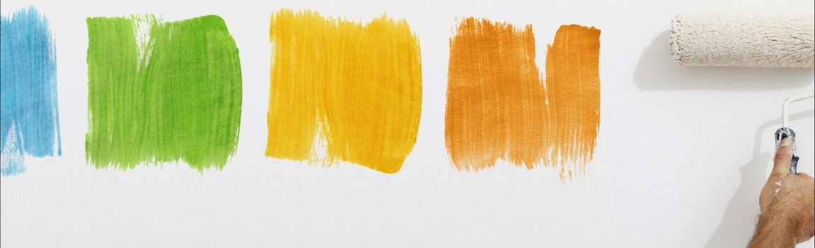
Choosing paint colors for your home’s interior can be overwhelming, especially when you consider color hue, saturation, temperature, and lightness. Hiring a professional color consulting service can help with the selection process, if you want to choose on your own it will benefit to learn more about the color wheel.
You understand that choosing the paint colors for your home is about more than just the colors you like. Selecting the right color shade will help create the mood you desire in each room of the house, while also promoting a positive flow of energy throughout.
We have a few methods that can help you learn more about colors and how to choose paint colors that complement each other for a harmonious home interior.
Understanding the Color Wheel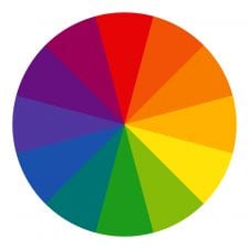
Let’s start with the color wheel. This is the first stop when choosing a color because it will help you determine the properties of colors and which ones complement each other.
You’ll use the color wheel to create basic paint color design schemes for your home. The color wheel will also allow you to determine the temperature of the color, which in turn helps create the color schemes.
The basic color wheel is divided into two parts: a warm half and a cool half. The warm half starts with red and runs through yellow-green. The cool half starts with green and runs through red-violet. Our eyes and brains perceive different wavelengths of light as colors – which means to us, warm colors tend to advance and cool colors tend to recede.
Warm colors typically draw in a space, making them feel intimate, while cool colors expand a space, making it feel more open. People use these rules to help them narrow down the best interior design paint colors for the various rooms in their home.
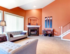
Make a room cozy and intimate by utilizing warm colors. A living room in a light orange or red paint can draw in a room and make it feel smaller. You can also use this method for a room that’s large and sparsely furnished for a more cozy feel.
Use a cool color like blue-green to open up a small bathroom. These hues will make the room appear more expanded than it really is.
Examples of Color Wheel Themes
Now that you understand the color wheel, you can use it to create themes in your home. Learn more about the common color schemes that people follow when choosing colors for their homes.
Monochromatic Color Scheme: Monochromatic refers to an interior design of various hues of one color. Variations of lightness and saturation can create a crisp, clean design. The best part is you can do this with almost any color you desire.
One way to put this in effect is by varying neutrals in a living room. Think of a deep tan like Sherwin Williams’ Dry Dock that’s accented by lighter colors like Pavilion Beige and China Doll.
Complementary Color Scheme: This means choosing two colors that are opposite each other on the color wheel. Depending on the saturation, these two colors can either be vibrant or more subdued. Either way, it will include both a warm and a cool color since they are on opposite sides of the color wheel.
One example of a complementary color scheme within the home is an orange and blue kitchen. The kitchen is an inviting, happy place so it’s fitting to use an exciting color scheme. And the contrast between the blue and orange adds an element of interest.
Analogous Color Scheme: An analogous color scheme is when three colors are used in a room that is adjacent to each other on the color wheel. An example of this is blue-green, green, and green-yellow. One color is dominant, while the other two colors serve as accents. Using these colors together makes for a harmonious, relaxing atmosphere.
Understanding Saturation, Lightness and Temperature
There are 3 primary ways to describe a color: saturation, lightness and temperature. These factors are crucial to determining the color palette for your home.
- Saturation is how intense a color is. 100% saturation is the most intense version of the color, while 0% saturation appears gray.
- Lightness measures the degree of black or white that’s been mixed with the color. More white creates a lighter color, while more black deepens the color.
- Temperature can reflect back to the color wheel, as it refers to how warm or cool a color is. Warm colors include red, orange, yellow and cool colors include green, blue, violet.
As a general rule of thumb, use varying degrees of each of these when selecting your color palette. A color scheme that is too saturated and dark will be overpowering, but if you use one highly saturated color with very light colors, it’s balanced and pleasing.
The goal is to achieve a palette of colors that are pleasing together to create a harmonious interior design. While color harmony is subjective, and what may not be aesthetically pleasing for you could be for someone else, these suggestions will help you find pairings and groupings most likely to work well.
My PaintColors, CertaPro Painters® virtual house painter, can help you visualize your interior paint color scheme. And if you’re still having a difficult time deciding, the experts at CertaPro Painters® of San Francisco will help you find colors that match your home’s aesthetic.
