Colors for Interior House Painting Kansas City
Posted on January 15, 2020
Now that 2020 is here, you might be searching for a new look in your home. Our pros are here to help and have picked out trendy and timeless colors for a cozy living area for your family. Here are some of the best Colors for Interior House Painting Kansas City.
Hazelnut
Using a warm and creamy brown will never go out of style. It’s easy to work with when it comes to furniture and accessories in your living space. The color opens the room up and makes an inviting environment to live in. If you choose a brown with golden tones in it, the color will bounce light around and make the room feel bigger than the square footage.
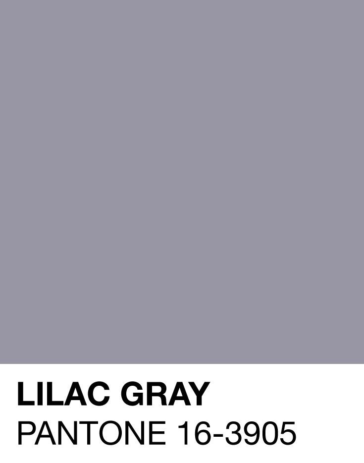
Lilac Gray

For a classic look with a trendy twist, choose Dove Grey. This is a warm grey that works in a classic yet modern way. The purple twist adds a bit of depth to what could come across as a cool color. This is a new take on a perennial favorite.
Deep Green
Hunter greens had a day in the limelight, to update them, choose Pantone’s Night Watch. It’s a relaxing color that brings nature inside. It’s a great botanical color for healing. The color of plant life is equal parts alive and spa-like serenity. Be cautious, deep greens with warm undertones can seem dark and dank if the room does not allow for a plethora of natural light.
Muted Pastel
Pastels are no longer relegated to powder rooms and nurseries. These chalky colors are a perfectly stylish option for kitchens and great rooms. Every pastel color brings warmth into a room. It’s a nice compliment to a dark marble or granite counter tops or back splashes while providing more color than a simple white.
Soft Clay

No longer are homeowners avoiding the red-brown color that makes up Soft Clay. Use the color to bring the Latin fire of Miami into a boring beige room. This hue brings a warm vibe into any room you put it in. Explore the whole family of red-browns: terra cotta, clove, burnt orange and caramel. Be sure to test the color around the room before you commit. It can be an assault on the eyes when overused.
New Blues
Boy are blue back in vogue. Rather than royal, head cooler. Colors like ice blue, grey blue and the barely there powder blue are the colors of choice. These are subtle enough to read as neutral but stylish enough to be blue. Opt for less pigmented colors or your room could feel cold and compact. The subtle versions of the color will work in any geography and any room.
Mustard
Go golden! For a warm gold color on your walls that comes with a punch of fun, try mustard. In a muted tone, this is deep and brilliant, plus being easy to work with. Mustard is a good option to create a sunny focal accent wall in a common area. When used with dark furniture, the color will create a renaissance-esque air of richness.
Mist

Looking for a non-color color? Try mist. The most muted blue available on the market. The color is white with a violet tint to it. It’s white without being boring. The color works across styles, decors and architectures. The barely there color is perfect to cover up imperfections in walls with ease.
Mushroom
Along the natural lines of Mist is Mushroom. This version of white has the tiniest amount of beige thrown in. It’s a far cry from the mousy 70s brown that used to be so popular. You’ll find it’s a timeless color that impresses even the harshest critics. It works well with neutral or vivid interiors and furniture.
Pewter
Move over greige, Pewter is here. With a bit less beige and a bit more silver, Pewter is all the rage for homes now. It works as a punched up version of shiny white. It’s a versatile color that our pros suggest to use in varying shades throughout your home. It’s monochrome with multi-style.
Ready to paint? Call us! Schedule a free, in-home estimate today to discuss your painting project.


