
Finding the right interior trim colors
Posted on May 16, 2024


When most people are planning to repaint the interior of their home their primary concern is about color choices and finishes for the rooms they plan to paint. What often gets little consideration is the color choice of their window and door trim. Trim serves as a counterpoint to your wall’s color choices, it adds a bit of style and can help set the mood as a secondary source of foundational color for your décor.
Let start with the safe option…
Well, let’s get the big one out of the way first. White is the go-to color for trim. White works well with everything, it’s bright, clean, and utilitarian. Don’t feel like you are shorting your design plans by sticking with white but here are two quick tips for white trim you should consider. First, consider using a semi-gloss or satin white that has a bit of reflectivity to it, flat or eggshell is a finish best left for the walls or ceiling. Secondly, don’t go for a white that is as stark as ceiling white. A slightly off-white or a milk-white works better and won’t look harsh or cold next to just about any other color. White also works across every style of décor from traditional to modern.
Now let’s look at bolder options…
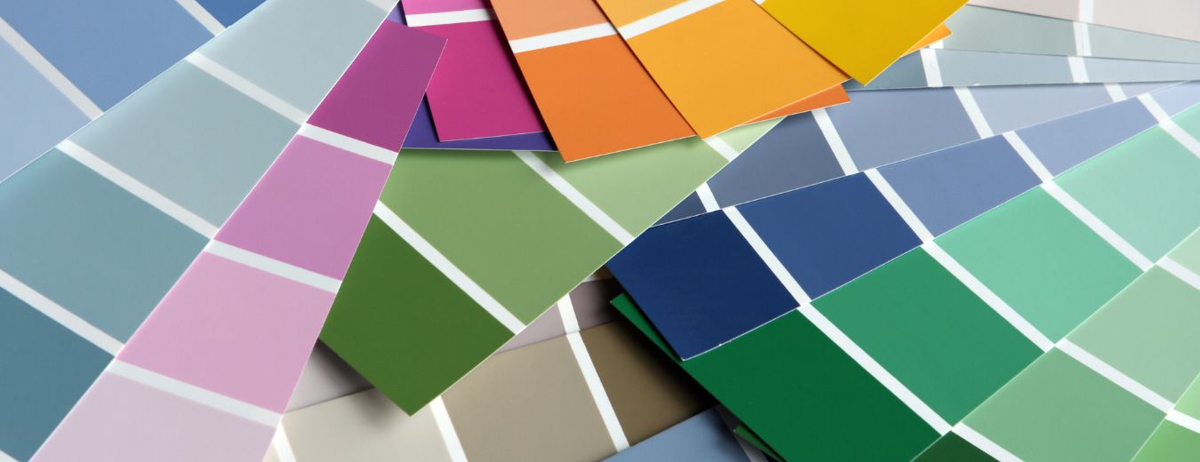
Complimentary colors in much lighter or darker shades work wonders. Matching shades isn’t a problem here as you can work right off the color chips if your preferred shade comes in a large enough range. Mixing light blue with navy trim, dark brown with tan or light green with forest green are all options. If you have a paintable fireplace mantel or wainscotting you can add them into the mix as well. Overall people are becoming a lot more experimental with color so as dramatic as this may seem it’s becoming more mainstream. By having a second shade you expand your décor options because you have two ends of a single shade to anchor to. Having a dark navy leather sofa in a very light blue room won’t have the same feeling of belonging with white trim as it would with dark, navy blue trim.
And to get even bolder…
Contrasting colors that run darker and bolder than your wall colors are a great way to add interest to a room. It may seem a bit daring but it’s not uncommon to see crown molding or chair rails painted dark to create a bit of drama, just imagine carrying it over to door and window trim. A dark brown against light green walls, a navy blue against light yellow walls, the options are endless. This works especially well in dining rooms and formal living rooms where you might want a more sophisticated or formal look. For real statements, you can use colors like maroon, dark green, black or gray. Imagine painting a cozy den in a shade of brick red with dark green trim. The shades can also be lifted from a rug, a piece of patterned furniture, or a large piece of wall art.
Want a way to take both of these bold options up another notch?
Try painting the trim in a high gloss finish against your walls eggshell or satin finishes. It will give your trim a near 3-D effect as the highly reflective finish captures people’s attention. If we have lost you at this point then we won’t even suggest painting walls and trim the exact same color like light purple however your teenager might like that for a bedroom choice…
If you find these options intriguing but aren’t quite sure which shades to pick CertaPro Painters of Sherman Oaks can make this simple for you, simply schedule a free color consultation today and meet an expert who can work with you to find the ideal color palette for your home’s interior, with or without white trim!
