

Understanding Paint Undertones in Your Paint Color Selection Process
Posted on December 31, 2020


There is something lurking in your paint, you can’t see it on the paint sample chip, you won’t notice it on the colored lid, you will only see it once you have committed to painting a whole wall, or two, or a complete room. It’s called “undertone” and it’s the color hiding inside your paint’s primary (or “masstone”) color.
Every color and shade of paint except for primary colors (red, yellow, blue) has an undertone, that is the color of the paint that was used to make the final color of paint you think you are getting. If you are buying turquoise-colored paint you know it’s made from a mixture of blue and green. The balance between the two colors leans towards blue so you consider it a blue paint. Once it’s on the walls however it’s going to subtly reveal more and less of the green depending on the lighting (throughout the day) and also by the color of other things near it.
Undertones are what make you say “this isn’t like the sample I looked at” and that’s because you need to look at your samples differently. Undertones can make your results a disappointment if they clash with the undertones of other painted surfaces and they are often the most pronounced in lighter colors. Off whites, beiges, tans, etc. are always going to have small amounts of other colors to move them away from pure white.
The undertones break into two primary groups – cool undertones and warm undertones. Cool undertones are in shades of blue, green, or purple, and warm ones are in shades of yellow, orange, and red. You can see what the undertones are going to look like by comparing your paint sample up against either a totally white surface or its nearest primary color. Very light color chips taped to a pure white piece of paper will reveal what color was likely used to move it “off white”. Adding a dash of blue to pure white paint will darken it in a way that differs from adding a dash of yellow.
Another way to figure out what’s “under” your paint color is to look at a paint swatch of your color but at its much darker tone, this will reveal the color used to make it and what its undertone actually is. If your subtle beige starts getting progressively pinker on your sample strip you know you are looking at a warm undertone created by red being added to the mix.
If you introduce cool undertones into a room with warm colors or vice versa you’re going to notice fairly quickly and you may do it purposely to balance warm and cool or you may want to make sure it’s all warm or all cool. What you don’t want is to be surprised.
A good way to see how your paint’s undertones are going to behave on your walls is to get a sample and paint it onto a large square of white backer board. Have someone move the large sample around the room to see how it interacts under different lighting and near different pieces of furniture or fixed elements like a fireplace, kitchen counter, or backsplash.
Since some elements in your home aren’t likely to be going anywhere (like your stone fireplace) your paint candidate has to play nice with them.
The amount of sunlight and what time of day it enters the room throughout the year creates an undertone of its own that will interact with the ones on your walls. In the Rock Hill, South Carolina area we are fairly far south so the sun tends to be higher in the sky on average than if we were in, say, the northeast. When the sun is rising and setting it falls into the warm undertone range, at high noon it’s showing you its coolest undertones.
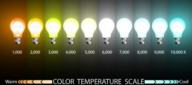
A bigger consideration is the impact of your light fixtures on the color sample. At night you’re likely to have lamps, recessed lighting, and maybe a chandelier turned on. These light sources have their own undertones. Older incandescent bulbs tend to give off a warm undertone of yellow but newer LED lights tend to give off cooler light with a blue undertone. If you are just in love with your paint choice and how it works in the room and something has to give, you may want to go looking for different light bulbs because most of them will have some information on their packaging addressing the “color temperature” and whether it’s cool or warm.
At CertaPro Painters® of Rock Hill, SC. we can offer you a free color consultation before the first drop of paint even hits the inside or outside of your home. Our experts know what works and what doesn’t and can help you avoid a mistake that might not be apparent until the painting project is finished.
When you have a painting project in mind, you know you have to do something, and you’re stalled at the point of color selection, give us a call at 800-462-3782 or schedule an appointment for both a free color consultation and a free estimate for your job so you know not only what colors to move ahead with but what it will cost to have real professionals deliver the results for you.
