
Inviting Home Exterior Color Ideas
Posted on April 28, 2020


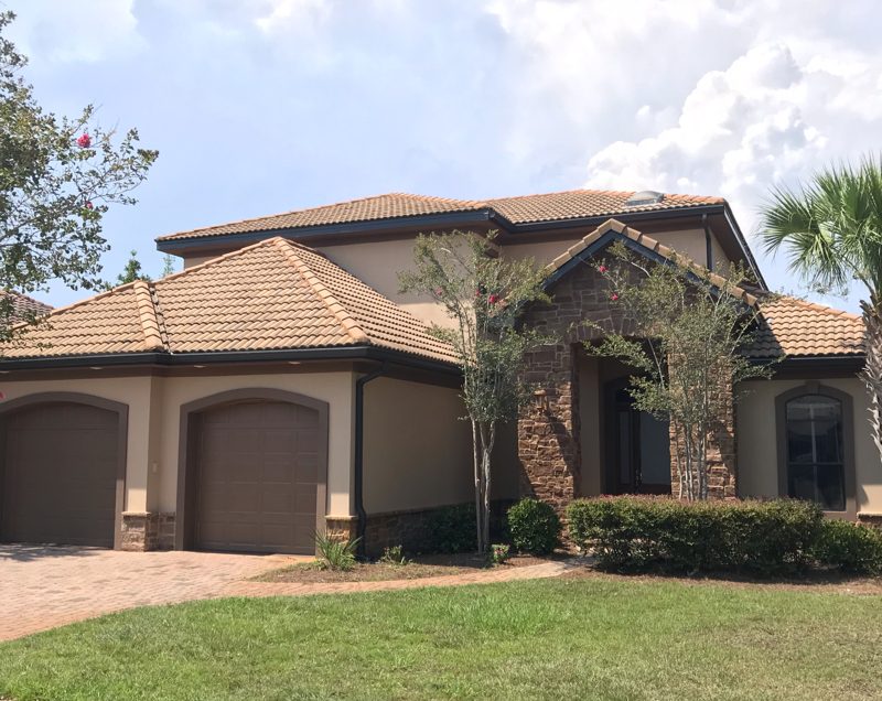
With warmer temperatures, many of us are heading outdoors for the first time since fall. Exterior house paint can take a beating over the long, cruel winter. The first order of business this spring should be an inspection of your paint. If you find you’re in the market for a painting, the second order is to find inviting home exterior color ideas.
Before you go wild with your color options, be sure to check in with any governing bodies. Local municipalities and HOA boards have acceptable colors to choose from. On the one hand, this provides colors that work in your area and are already created in a palette. If you are not under any governing restrictions when it comes to color, here’s where to start according to the residential painting experts at CertaPro Painters of Northwest Florida.
Ivory and Cream
Probably the easiest colors to work with are ivory and cream. These just off-white colors work for any style and age home. While evoking a sense of formality, the color is elegant and allows other items of color on your property to take center stage. This could be a flowering tree or pretty painted planters.
Taupe and Grays
For a more stylish but easy to work with color, opt for taupes and grays. These options use inspiration from the natural colors around making them perfectly paired. Working these colors in with a gray walkway or light brown tree gives the property a pulled-together look without working too hard.
Blue Grays
If grays and whites are not bright enough to tickle your artistic side, opt for other natural but brighter colors. Blue grays are a way to use a muted blue while staying within a natural palette. A blue gray home is sure to make your house stand out in a sea of white and beige. Blue gray brings a serene stillness to a home while opting for a nautical nod. This is perfect for a beachside cottage or to bring the beach to the desert.
Green and White
Green and white in combination create the feeling of a woodland escape, even if you’re nowhere near a forest. For best results, avoid bright grass green. Instead opt for a more muted tone like versions of sage. Pair it with dark navy blue or white to allow the green to pop. These colors are especially successful against the deep reds of the desert backdrop or in a mountain background.
Get Creative Help
When you consult with an estimator, ask about the opportunity to work with a color consultant. Many professional painting companies employ individuals with special training in color use to help customers with just this sort of dilemma.
CertaPro Painters has color consultants on hand to help with your pairings. Schedule a free, no-obligation consultation with our team to discuss your upcoming painting project.
