4 Trending Paint Colors That Will Give You a Fresh Start
Posted on September 11, 2019
As we head into a new season, why not update your interior colors too? Bring in new shades to impress holiday visitors with vivid and trending updates. Here are 4 trending paint colors that will give your interior a fresh start.
Lilac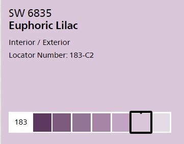
Take a nod from the flowers outdoors like Forget Me Nots and Lilacs of bluish-purple colors. The color is a big hit on walls as an alternative to the blander off-white. The color is lovely in a dining area, but also appropriate for a boudoir. It can be made more girly with feminine furniture and a chandelier. Or take it to a more unisex look with heavy wooden furniture and more blue tones. It’s a great color to set off antique furniture or warm wicker. More information on Euphoric Lilac on sherwin-williams.com.
Cranberry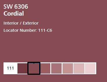
Red can raise blood pressure and enhance arguments, but using a muted cranberry is less overwhelming and more uplifting. The color makes for a good backdrop for conversations and family get-togethers. The color works well in common areas and offices or libraries.
More recently, the combination of deep red walls and bright blue furniture or textiles has been popping up all over magazines and in homes across the area. It’s an unexpected pairing that’s both stunning and livable.
The only warning with deep, rich red is in bedrooms. The color can be read as stressful and make rest hard in the room. Click here for more information on this color.
Fir Green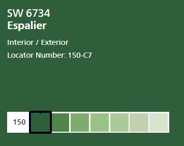
Jewel tones are still on trend this year and are being used in fun and different ways. Green is no exception. In the change, Emerald is out and it’s darker, more mysterious cousin Fir is in. The color provides a brain-enhancing color that’s fit for conversation or contemplation.
Last year’s jewel colors aren’t going anywhere — they’re just taking a slightly more muted approach. Rather than gleaming emerald, go for its darker cousin, fir green. Take a masculine approach to the room with dark wooden furniture and gold accents. It’s perfect for an office or guest room. Click here for more information on this color.
Nautical Blue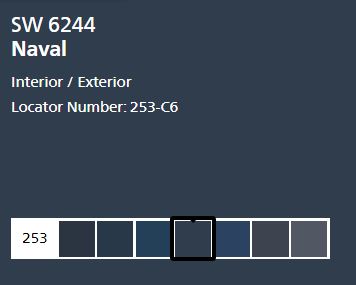
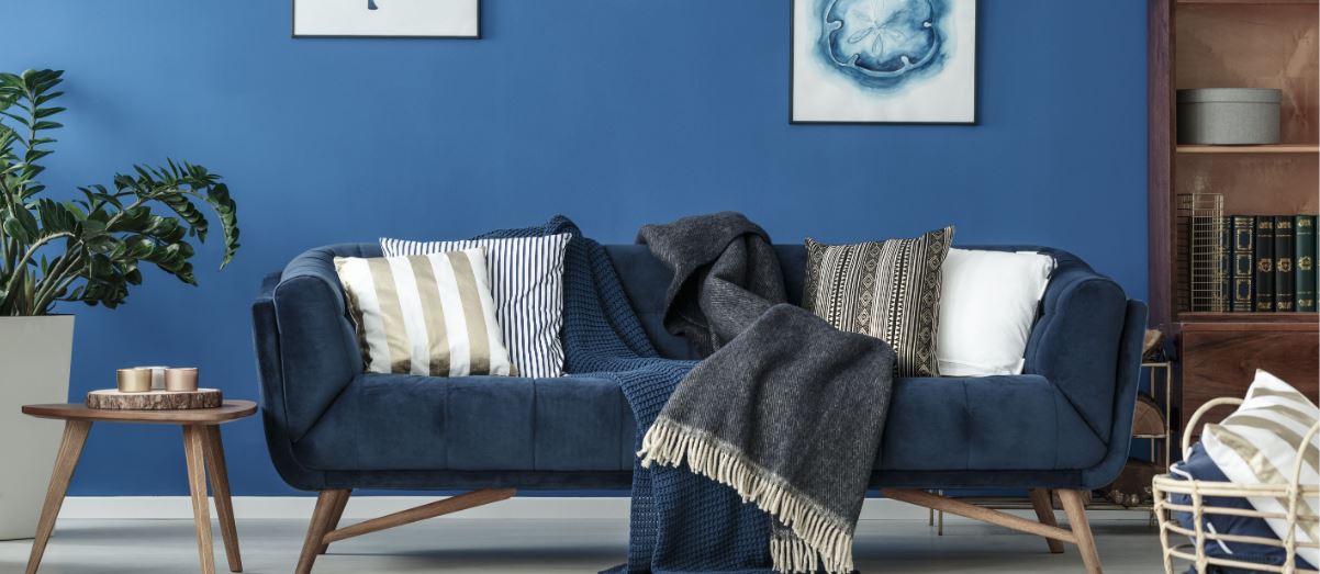
Blue is a perennial favorite, but nautical blue is experiencing a spike in popularity. The color is relaxing and flexible enough to be used in nearly any setting of your house. For an entryway or living area, get traditional nautical blue and pair it with gold and white for a true beach house look. When working in a bedroom, mix the colors with mauve and cream to lighten the deepness of the color.
Foyers are a great place to put navy blue walls. The color sets the tone for your home with a strong and relaxing blue. It’s particularly successful against a staircase of white or white and wood. Your home will seem like a coastal retreat. Use some art that combines the colors to tie the whole area together. Click here for more information on nautical blue colors.
At CertaPro of Northridge-Granada Hills we offer a whole host of painting and home repair services so if you’re ready for new look for your home have our experts come and give you a free, in-home estimate for your project. Ask about our color consulting services for your paint job.


