
Color Tricks From The Trades: Why There’s Green at the Meat Counter
Posted on January 12, 2026


After running a painting company for more than 30 years, my greatest strength was never color theory.
It was finding great people—and inspiring them to be even better.
That said, when you spend decades inside homes, historic properties, retail spaces, and design conversations, you can’t help but pick up a few color tricks along the way. And one of my favorites explains something we’ve all seen but rarely stop to question:
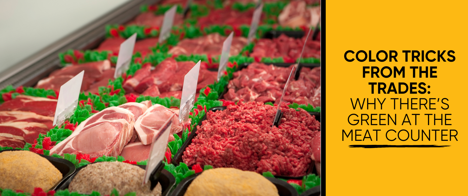
Why do they separate the meat at the butcher counter with green cellophane?
Before we get there, here are a few practical color lessons straight from the trades—simple ideas that make a big difference in how a space feels.
Why Walmart Feels Different Than Nordstrom (Before You See Anything)
You can feel the difference the moment you walk in—long before you look at the products.
That’s lighting.
Warm lighting costs more, but it creates a welcoming, comfortable, and optimistic feeling.
Cool blue lighting is cheaper and more efficient, but it reads clinical—and for many people, subtly depressing.
When I moved into my new home (nicknamed The Treehouse), one of the first things I did was remove every blue-toned bulb and replace them with warm lighting. Same rooms. Same furniture. Completely different emotional experience.
In the trades, we know this well: color always starts with light.
Chair Rails & the Two-Shade Rule
If you’re adding interest to a dining room or hallway with a chair rail, here’s one of the most common mistakes people make:
They choose a color that’s only one shade lighter or darker than the other wall.
The problem? Your eye barely notices it.
To make the contrast feel intentional, you need to go at least two shades off. That’s when the separation becomes clear and the design feels purposeful—not accidental.
Subtle is good. Invisible is not.
Why Touch-Ups Fail (and Why Pros Paint to the Corner)
Take a close look at any corner in a room.
Even when both walls are painted the exact same color, one wall will always appear darker than the other because of lighting and shadow. That’s why spot touch-ups almost never disappear.
Professionals paint to the corner. Once you stop at a natural break, your eye stops comparing—and small differences in color or sheen vanish.
It’s not about better paint. It’s about understanding perception.
Your Best Color Inspiration Might Be a Plane Ticket
Have a place you love?
Mykonos. Tuscany. Nantucket. Charleston.
When you bring those colors into your home—sun-washed whites, warm blues, earthy neutrals—you’re not just decorating.
You’re recreating a feeling.
The best color choices aren’t always trendy. They’re personal. They come from memories that make you feel relaxed, inspired, or at home.
So… Why Is There Green at the Meat Counter?
Here’s the trade secret. On the color wheel, green sits directly opposite red. Opposite colors don’t compete—they intensify each other. When green is placed next to red, the red appears richer, bolder, and fresher to the human eye.
That thin sheet of green cellophane doesn’t change the meat at all. It changes how your brain perceives it.
Same meat. Better presentation.
This same principle applies in homes every day:
• Purple pops in a yellow room
• Blue feels stronger next to warm wood tones
• Green plants look greener against brick or terracotta
Color isn’t about the color alone—it’s about what surrounds it.
Final Thought
You don’t need to be a designer to use color well.
Tradespeople learn this by watching how spaces behave in real life—how light moves, how walls interact, and how people respond emotionally. Once you understand that, you stop choosing paint colors in isolation and start designing how a space feels.
And yes—you’ll never look at a meat counter the same way again.
Need Help Choosing the Right Colors?
We offer:
• Virtual color consultations
• In-person color consultations
• Free paint chips sent directly to your home
So many great resources to help you get it right the first time:
https://certapro.com/bryn-mawr/house-painting/services/color-consultation-specifics/
