
8 Paint Colors That Will Make It Easier to Learn
Posted on June 19, 2019


Now that little learners are off for the summer, it’s a good time to consider a color change in classrooms, study rooms or bedrooms. Colors can affect mood and memory or even help concentration and focus. Here are 8 colors that will make it easier to learn.
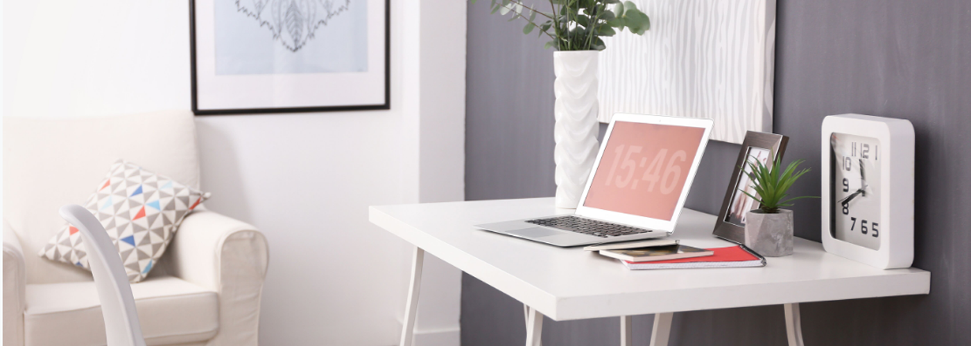
Off-White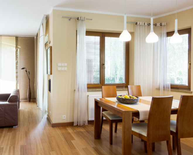
Many times dining room colors are chosen based on conversation and eating. More often, the dining room is also a study zone. Off-white is calming and gives positive vibes to anyone in the room. We could all use some calmness when those algebra problems get touch. Plus, the color pulls double duty. It is good for eating and conversations as well.
Red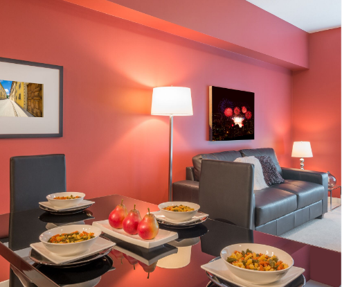
Red can be a tricky color when used for learning. Many homeowners have found a good mixture of gray and red creates a feeling of alertness and creativity. This color combination works especially well in kitchens, where laptops reside when it’s not mealtime. Try it with kitchen cabinets in gray and red pops of color throughout the room. Be cautious with red, it can be overused and pull in feelings of annoyance and anger.
Orange
Orange brings brains a feeling of creativity and focus. Use softer oranges like sherbet and incorporate green to help avoid an overwhelming feeling in the room. The green will add calmness to the people in the room and create a balanced color scheme.
Yellow
Bright reds and oranges are very stimulating but can overtake the room and help little ones bounce off the walls. If you’re considering citrus for walls of a room they will be in for longer periods of time – like a playroom – try a soft butter yellow. The color helps bring attention into focus and calms crazy kids.
Brown
Think about brown if you’re looking to paint a home office. The relaxation it brings to a room can be too much for little learners, but when it comes to adults in need of focus, it’s perfect. Mix a few browns together to avoid boring, and enjoy the reduction of fatigue the color offers.
Green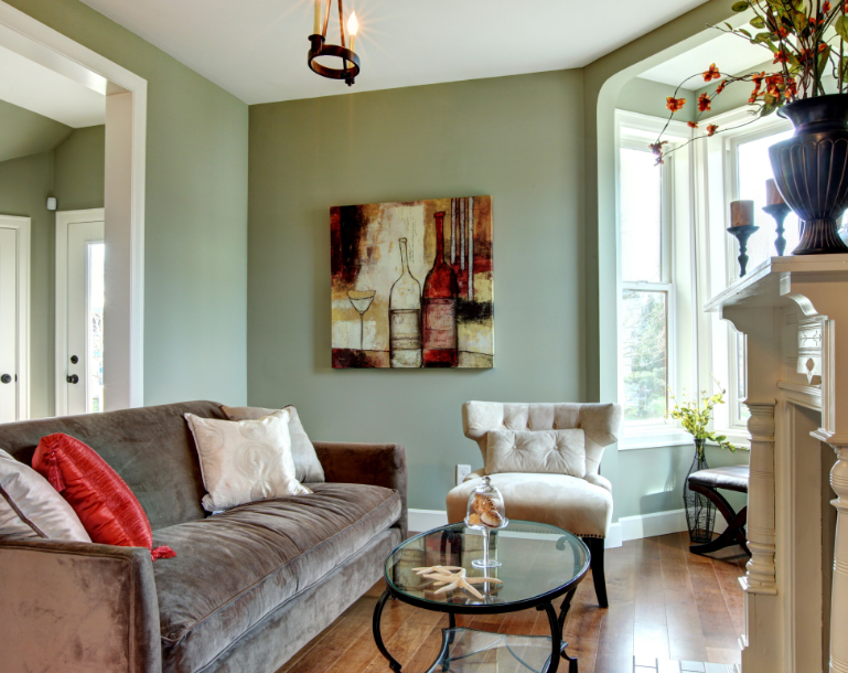
Nature makes us stop and breathe. Green in a room causes the same reaction. Make a reading nook that uses the color to promote thoughtful endeavors and long afternoons. Avoid institutional greens that you see in hospitals, and go for leafy, natural green. Make nature more vivid by incorporating wooden furniture and house plants. It’s an outdoor retreat without the ants.
Purple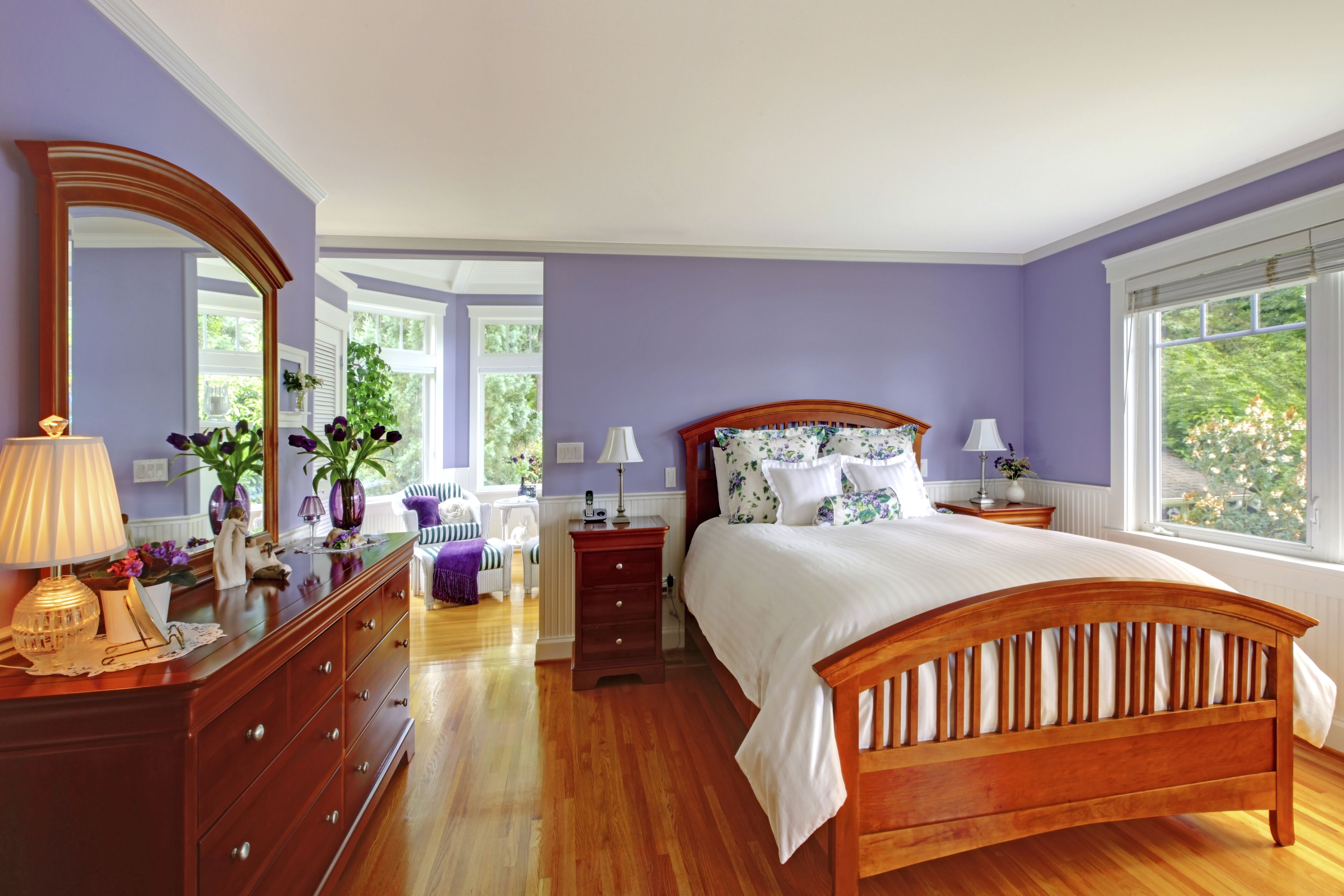
Purple can be overpowering for a learning area, unless you stick to the paler hues. A calming lavender can impart a spa-like sense of relaxation in a workspace. The color is perfect for a child’s room where reading and working have to compete with video games and mobile apps. It will turn on their brains and make cognitive correlations more clear.
Blue
Blue can be a downer as a wall paint, but when used right the calming neutral will bring an ethereal feel to a room. Walk the line between causing naps and overstimulation with sky colors. Bring pops of brighter colors in through textiles or furniture pieces. Add some teen posters and you have the perfect room for a pre-teen boy to study and play video games.
Still confused about colors for learning? Talk to one of our color consultants to find the best options for your room.
