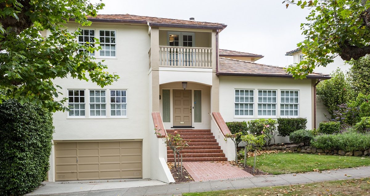
Exterior Color Selection Tips for Homeowners
Posted on April 25, 2022
Choosing a color for your home’s exterior can be one of the most daunting decisions prior to actually painting. What colors are right for you? For your neighborhood? There are a lot of opportunities that come with repainting a home’s exterior. You have the chance to mix it up and even change the entire color scheme if you choose to do so. No matter what choices you make, painting your home’s exterior will improve curb appeal, increase your home’s value, and help protect it from the elements of Mother Nature.
Take a look at these exterior color selection tips for homeowners, from our friends at Sherman-Williams paint.
Q: What are the most common mistakes homeowners make when choosing exterior paint colors?
A: Assuming that a colorful and imaginative color scheme will cost a great deal more for product and labor. Unless the scheme is a “painted lady” with numerous colors, this is rarely the case.
Accenting unattractive elements such as gutters, downspouts, a protruding garage door, air conditioning units, unevenly placed windows, etc.
Ignoring neighboring houses: your color scheme choice should not clash with the neighbor’s house — it’s a lose-lose situation. Choose a scheme that blends with the neighborhood or stands out in a subtle, unobtrusive manner.
Landscaping counts: consider tress that change color, flowering shrubs, flower gardens when selection colors, for compatibility. Heavily wooded lots will make colors look darker due to shade; also could camouflage homes, so attention to detail is needed. Greens are not a good choice in this situation.
Q: What opportunities do homeowners commonly miss when selecting and placing colors on their homes’ exteriors?
A: Color makes a first impression, an individual statement and can enhance curb appeal and even resale value; a creative scheme versus the more typical white could be an opportunity to make that first impression.
Don’t overlook interesting architectural detailing; it can often sparkle with a contrasting or accent color.
Be observant: drive through various neighborhoods, established and new, to see color in action. Make note of appealing color schemes and consider adapting them to your own home.
Assuming no structural work is needed, color/paint is the most cost-effective approach to changing the appearance of a home.
Define the entryway by using color as a “Welcome” sign.
Windows are an opportunity: they give character to a house. Outlining them lends crispness to the color scheme.
Q: What steps should homeowners take to eliminate surprises and gain confidence with color?
A: Consider the colors that can’t change (for example, elements such as roofing shingles, and brick, slate, and stone accents or features) and use these elements as color resources because there are numerous shades and hues in building materials. A charcoal gray shingle for example could have flecks of gray-green or gray blue that could be found on a paint color strip or incorporated into the color scheme.
Examine color samples outdoors, at various angles and different times of the day. Consider buying small quantities of desired colors and paint a section of the house where body, trim and accent colors can be viewed together.
Pay attention to geography, specifically the intensity of the sun. Intense sun washes out colors, so brighter colors are suitable in sunbelt areas but might stand out like a sore thumb in northern locations.
Q: Are there any rules of thumb about color placement on a home?
A: A large home on a small lot painted white or a light color – for instance, a tinted neutral – can make the house seem larger and the lot seem smaller. Dark colors can make a home look smaller but more substantial.
A safe and effective approach to color placement is to select two tints or shades from the same color strip a few shades apart. Either the lighter or the darker shade could be used for the body and the opposite for the trim. A contrasting accent color could punctuate the door. Lighter colors on a porch will make a home feel more “approachable” and welcoming.
Height can be scaled down by painting the upper portion of a tall house a deeper tone than the bottom portion (reverse trim color). This is also effective on a small lot or when landscaping is immature. Conversely, a darker color on the lower portion grounds the house to the earth.
Light or white is a good choice for windowsills for reflection of the sun’s heat and light. Light colors advance in space; dark colors recede. If a house is placed far away from the curb, painting it a light color will visually bring it forward.
Be judicious with accent colors, but certainly accentuate the positive.
Q: Why are white and light colors so popular?
A: Traditionally, white and light colors were perceived to be safe choices. However, as consumers have gained more confidence with color, and as a broader spectrum of colors have been made available for exterior use, those “traditional” approaches are changing. Today, tinted neutrals that play off landscaping and other building materials are increasingly being used, as are midtone values of neutrals.
Let’s Get Painting!
Our team at CertaPro Painters® of San Francisco is trained to help walk you through the process, from color to finish. Schedule your estimate online, or by calling us at 415-661-8400 to speak with a painting professional about the painting plan that fits the goals of your space and your budget.


