
Experts Favorite Office Paint Colors
Posted on April 27, 2020


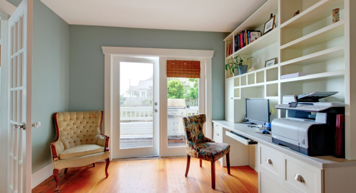
There are shelves full of books on how to be productive. Little did you know, all you needed was a new paint job. Color psychology can help you choose a color that lends itself to your style and your productivity needs. We asked the experts at CertaPro Painters of Palatine for their favorite office paint colors to get you started.
Studio Green 93, Farrow & Ball
This deep green works either in satin or matte finish. The color is moody and dramatic for a home office. Pair the color with loads of light to avoid afternoon lulls and the color will bring you a sense of harmony.
Pointing, Farrow & Ball
This color looks like a simple white, but on the walls, it makes the room pop. With warm undertones in gold and pink, the walls act like a natural Instagram filter with a perfect glow in well-lit afternoons.
St. John Blue, Benjamin Moore
This color is a good combination of bright blue paired with gray. Use it as the setting for an office that is home to a creative. This color promises to be inspiring and motivating while remaining tranquil.
Gentleman’s Gray, Benjamin Moore
Dark and moody colors set the tone in a home office. This blue-black is perfect for leather sitting chairs, brass reading lamps and long conversations over brandy. In a room with ample light, the color will sing from the walls. This is a color you can’t quite put your finger on which is perfect for daydreaming about your next project.
Simply White, Benjamin Moore
For a clean office, use this perfect white to make crisp walls. This color includes enough warm undertones to avoid a cold and stark wall. Many home office owners like white to give them a blank slate to start each day off and this color is the perfect way to use white.
Ral8022, RAL Color Chart
Do not shy away from bold, dark colors in your office. Use this black-brown sparingly but it’s a stylish and eye-catching option. While remaining understated, it’s chic in a sepia tone. Try this with a matte finish paired with stylish furniture to set the tone for your day.
Charmed Violet, Benjamin Moore
You can use color to improve your mood, while heading into your home office. Try a perfect lavender to set a happy and positive tone. The color boasts a confident and cheerful look. Use it equally well with light or dark furniture and accessories.
Blue Note, Benjamin Moore
Another of our not-quite-totally-nameable colors is Blue Note. This is a deep blue-gray-purple that is dripping with drama. Use a color like this with a natural desk and credenza for a perfect match. Your office is sure to be dripping with drama.
Shaded White, Farrow & Ball
Create the feel of stepping into a creamy cafe au lait with this brown and white mixture. This is the perfect background for decorations or artwork to take center stage. The color is clean and warm while working for a masculine or feminine feeling room. This is a great color to let your personality shine through.
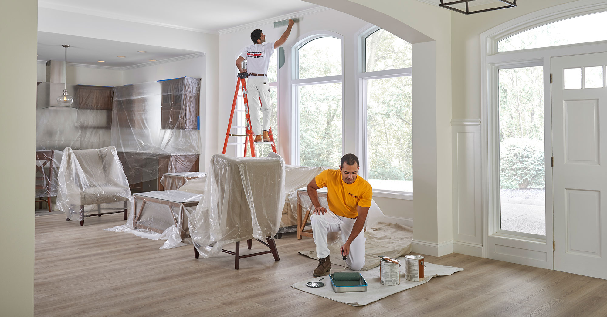
Choose a color that works with your style, personality, and needs. This should be a personal choice. If you’re ready to make a change but need some help, our crews are here! Schedule a free, no-obligation consultation with our estimate team today.
