
6 Worst Colors to Paint Your Home (and What to Pick Instead)
Posted on May 27, 2019


Whether you’re refreshing a room or giving your entire home a makeover, the choice of paint color can make or break the ambiance. While personal taste plays a significant role, there are certain hues that, according to designers and psychologists alike, can negatively affect the mood, perception, and value of a space. In this blog, we’ll delve into the six most ill-advised colors for painting your home and offer palate-pleasing alternatives to ensure your walls inspire joy, serenity, and maybe even a touch of envy among your guests. Read on to make informed choices that will elevate your living spaces.
1) Your Exterior Paint Color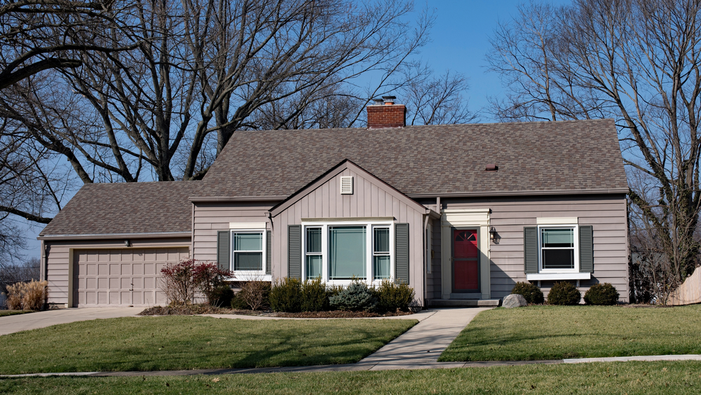
Don’t: Brown
Brown is seen by potential homeowners as boring and bland. Colors that lost value included brown, taupe, tan, and beige.
Do: Greige
Greige is perceived as an updated and modern version of beige, often enhancing a home’s curb appeal.
Bonus:
Pair your greige exterior with a rich front door. Doors in navy, dark gray, or charcoal are often perceived as luxurious and sturdy, traits any homeowner would be looking for in a new place.
2) Your Kitchen Paint Color 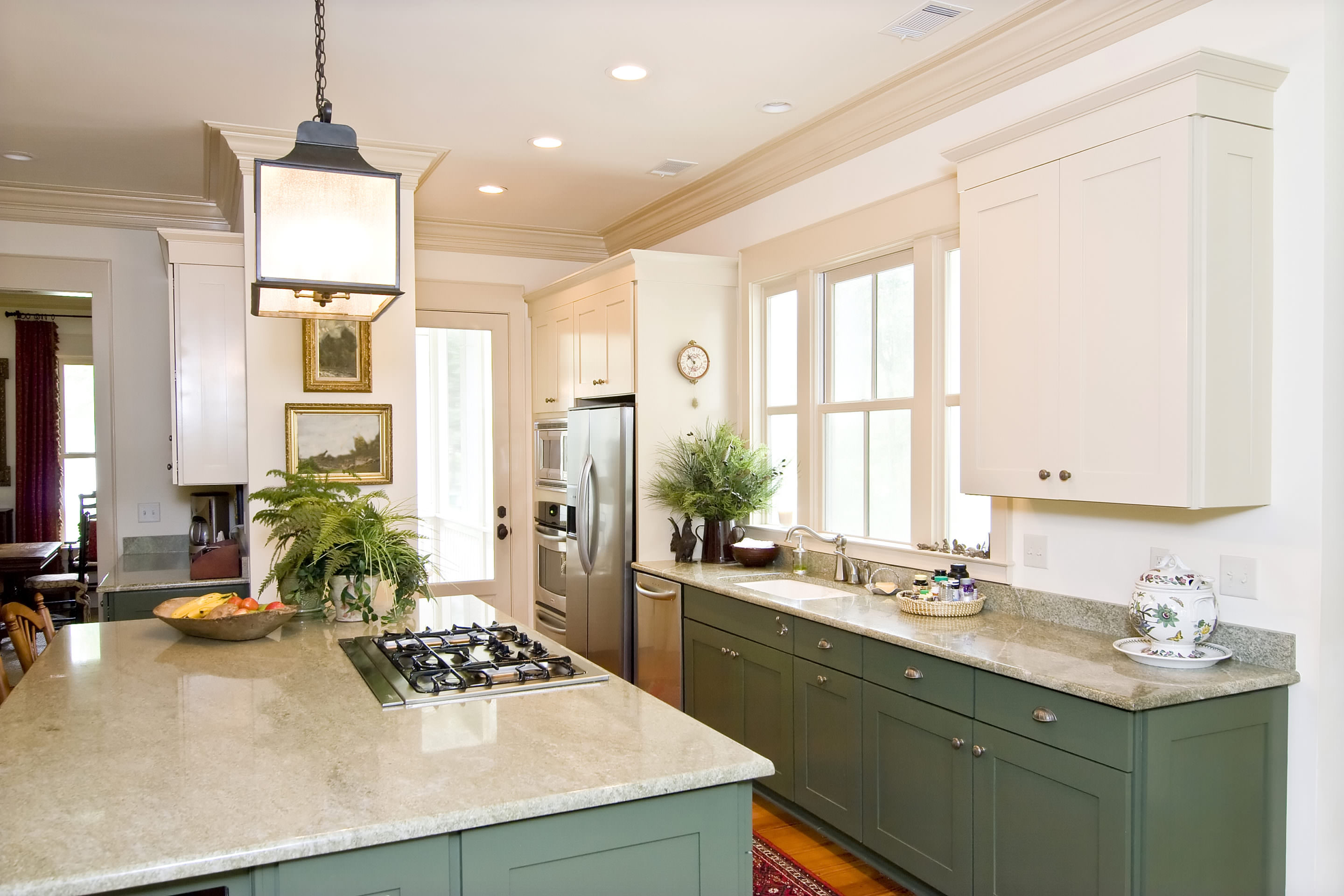
Don’t: Yellow
While soft yellow kitchens were in demand in past years, buyers nowadays seem less keen on overly bright yellows. Color stylists note that while a buttery yellow can be uplifting, it’s easy to overdo it, making the space feel overly bright and even anxiety-inducing.
Do: Blue
Soft blues, light blues, and grey-blues have become increasingly popular. Considering the kitchen is one of the busiest rooms in a home, a calming blue hue is a logical choice.
Bonus:
Complement your soft blue kitchen walls with warm wood accents or brushed metallic finishes. Think of walnut bar stools or brass pendant lights. These subtle details not only create a visually enticing contrast but also provide a touch of luxury that appeals to prospective buyers.
3) Your Bathroom Color Scheme 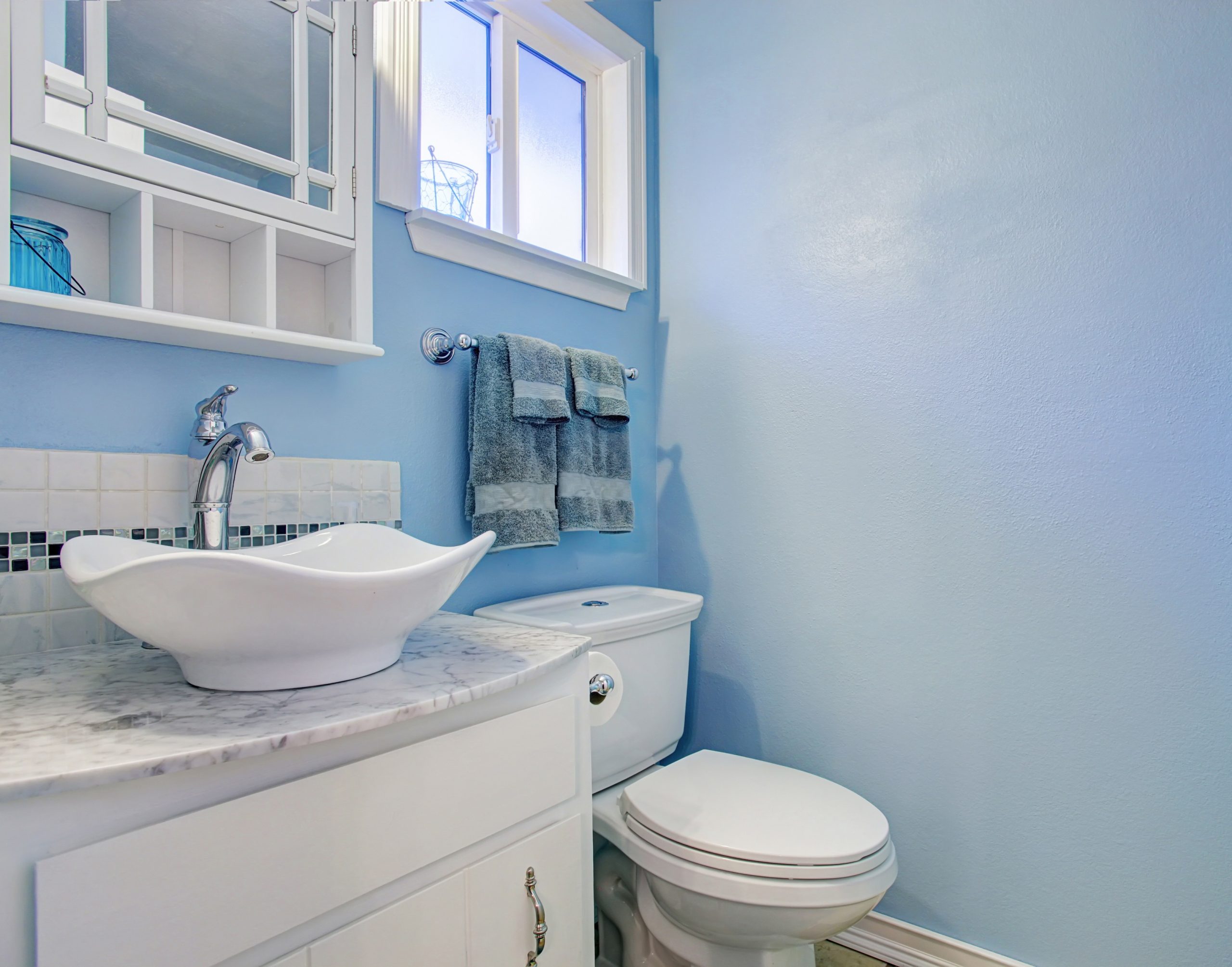
Don’t: White
White and just off white bathrooms seem like a no-brainer for bathrooms but your buyers won’t go for it. While white does make a small room look bigger, it also can make the walls look flat and dead, more so in a room that is lacking natural light.
Do: Powder Blue
Light blue shades, such as periwinkle, have been a popular choice for bathrooms, often enhancing the perceived value of the house.
Bonus:
Opt for ambient lighting or introduce elements like indoor plants to add a touch of warmth and vibrancy.
4) Your Bedroom Paint Colors 
Don’t: Pink
Colors like antique rose, although seemingly relaxing, might not be the best choice for bedrooms, especially given the waning trend of colors like millennial pink.
Do: Blue
Blue takes the win again when it comes to bedrooms. Cadet Blue and Light Cerulean were the favorites for buyers in recent market reports.
Bonus:
A blue bedroom offers a serene escape. To elevate the space, introduce plush textiles such as velvet throw pillows or a soft, neutral-toned rug. These additions can transform the bedroom into a cozy sanctuary, offering a tactile appeal that potential buyers find irresistible.
5) Your Dining Rooms Paint Colors 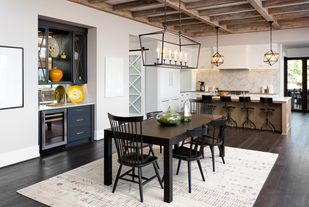
Don’t: Terracotta
Terracotta, even in muted shades, is better suited for pottery than walls. Similarly, red and copper might not be the best choice for dining rooms.
Do: Slate
Shades like slate or pale gray-blue paired with white shiplap trim have seen increasing appreciation.
Bonus:
Once you’ve painted your dining room in slate or pale gray-blue, consider adding some gold or brass fixtures, like a statement chandelier or wall sconces. The combination of cool tones with warm metal accents creates a sophisticated ambiance perfect for intimate dinners or festive gatherings.
6) Your Living Room Paint Colors 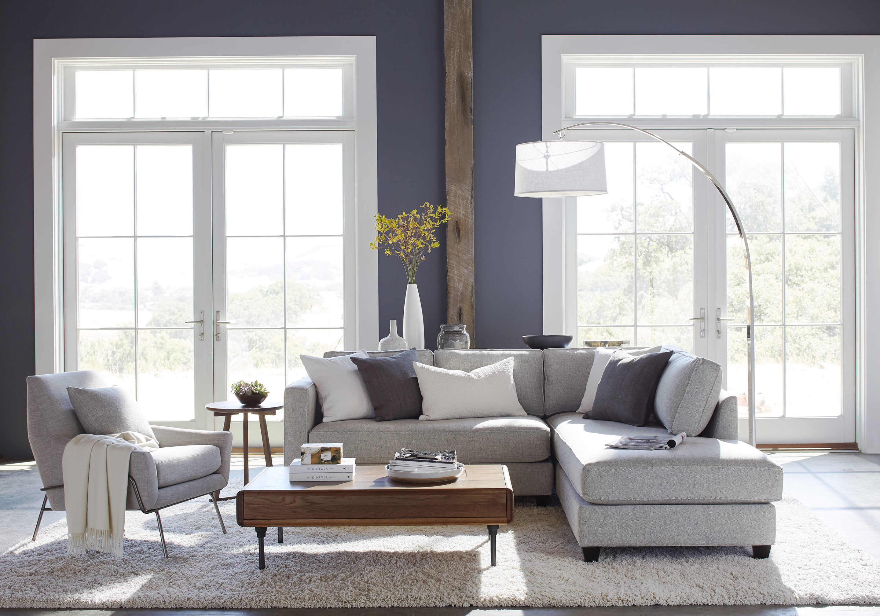
Don’t: Gray-blue
While blue, specifically gray-blue is winning in several rooms of your home, buyers say keep it out of the living room.
Do: Beige
While beige is the color equivalent of boring, buyers are loving it in living rooms. Homes with oatmeal or pale taupe have often sold faster than the gray-blue style.
Bonus:
With a neutral beige backdrop in the living room, make a statement with vibrant accessories. Whether it’s a colorful rug, patterned cushions, or striking artwork, these touches of color can bring life to a beige room, making it warm, inviting, and engaging.
Get a Free Color Consultation in North San Diego with CertaPro Painters!
In the vast world of colors, making a choice that complements your home and resonates with your aesthetic can seem daunting. Yet, as we’ve explored, some colors are best left off our walls to ensure a harmonious and welcoming environment. But remember, you don’t have to navigate this journey alone. The experts at CertaPro Painters of North San Diego have an eye for detail and a palette of experience. Why gamble on a shade when you can get it right the first time? Reach out to CertaPro Painters of North San Diego today for a free color consultation, and let’s paint a brighter, more beautiful tomorrow for your home.
