



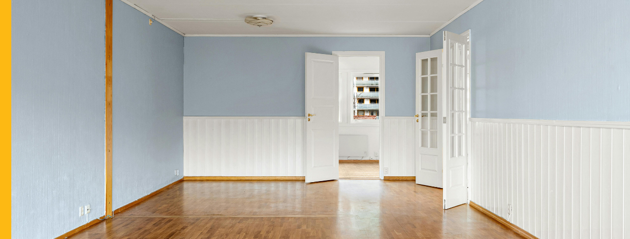
Two-Tone Wall Ideas: Paint Color Pairings and Design Tips for Every Room
Posted on July 25, 2026



A fresh paint color can transform the look of an interior, but combining two coordinated colors can create an even more distinctive result. Two-tone walls place complementary paint colors on a single wall to build depth, draw attention to architectural features, and produce a personalized design that appears intentional without feeling excessive.
This painting style has grown increasingly popular in both traditional and contemporary homes, including properties across Poway and East San Diego. Yet two-tone walls are not simply a temporary decorating trend. When the colors and placement are thoughtfully selected, they can make ceilings appear higher, give large rooms a more welcoming scale, emphasize architectural details, and separate areas within an open layout.
Whether your preferred combination involves subtle neutral shades or a dramatic pairing of light and dark colors, homeowners should consider several important factors before beginning a two-tone interior painting project.
Key Takeaways
- Two-tone walls provide more than visual variety. Coordinating two paint colors can distinguish individual spaces, showcase architectural features, and influence how a room feels without the expense of remodeling.
- Choose each color for a reason. Matching colors with related undertones or pairing a neutral with a bold accent produces contrast while keeping the overall design unified and balanced.
- The position of the colors affects the room’s proportions. Chair rail divisions, lower-third applications, ceiling-level accent bands, and color-blocked sections can make walls seem taller, large rooms feel cozier, or focal areas attract more attention.
- Two-tone treatments can be used throughout the home. Living rooms, dining rooms, bedrooms, offices, foyers, and even painted kitchen cabinets can benefit from carefully chosen two-color palettes.
- Professional painters help create the cleanest finish. Precise dividing lines, even transitions, and expert assistance with color and layout selection contribute to an attractive, long-lasting result.
Why Choose Two-Tone Walls?
Using two colors in a room is about more than creating a visible difference between the upper and lower sections. It can reshape the entire atmosphere of the space.
Some of the primary benefits include:
- Creating the appearance of taller ceilings or broader walls
- Introducing architectural detail without construction
- Establishing separate zones within an open-concept home
- Emphasizing built-in shelves, fireplaces, trim, or molding
- Bringing color into the room while retaining a timeless balance
Two-tone walls guide the eye toward specific portions of the room. This can make the interior feel more dynamic while still supporting the home’s larger decorative style.
Start with a Color Palette That Works Together
Selecting two colors that complement each other is one of the most important decisions in the project.
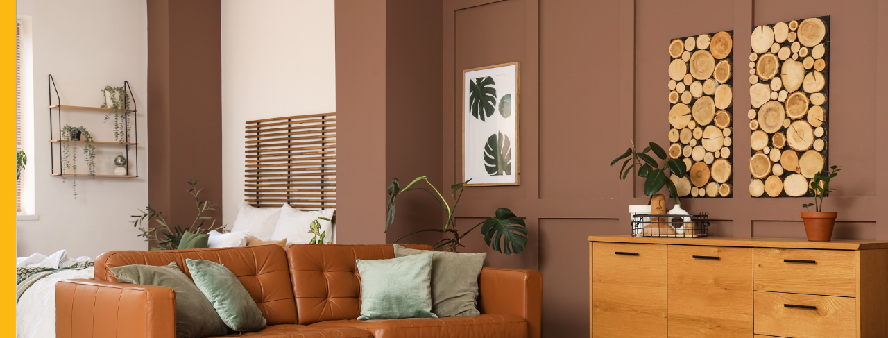
Warm & Traditional
Warm palettes create inviting, comfortable interiors and often work particularly well in living rooms and dining spaces.
Examples include:
Cream and warm taupe
Soft beige and chocolate brown
Ivory and muted olive green
These combinations create gentle visual depth while retaining a traditional, enduring appearance.
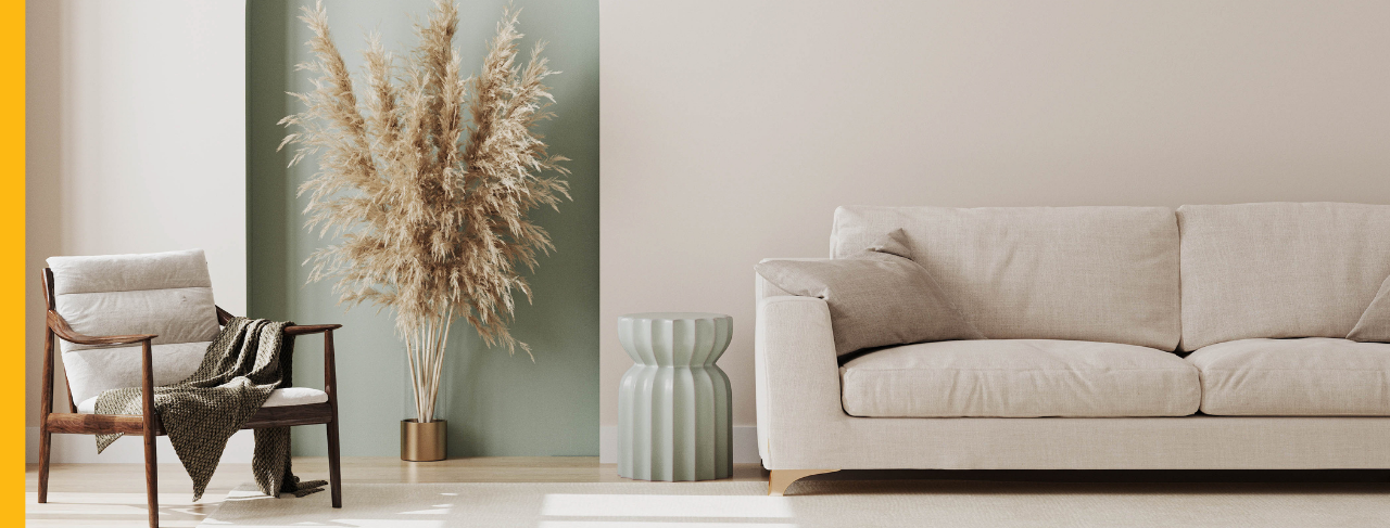
Bright & Airy
In bathrooms, bedrooms, and spaces with generous natural light, pale combinations can help the room feel brighter, calmer, and more open.
Popular pairings include:
Crisp white and pale sage
Soft gray and white
Warm white and dusty blue
These colors create enough contrast to provide definition without dominating the room.
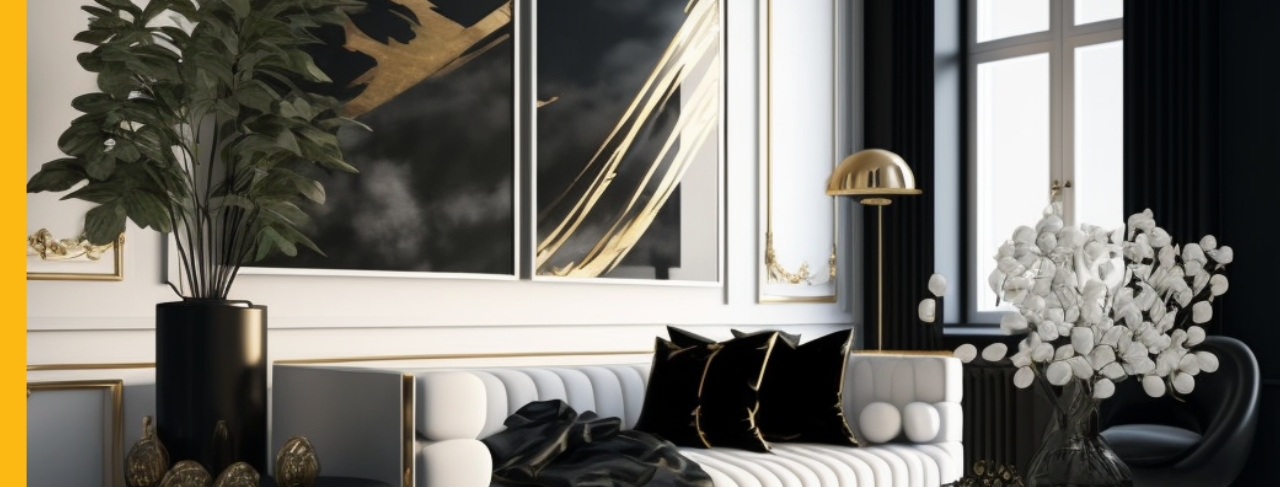
Modern Contrast
For a streamlined, contemporary appearance, consider combining a pale neutral with a deeper accent shade to establish bold, clean lines.
Examples include:
White and charcoal
Greige and deep black
Mushroom and navy blue
These palettes are especially effective in home offices, entrance areas, and modern living rooms.
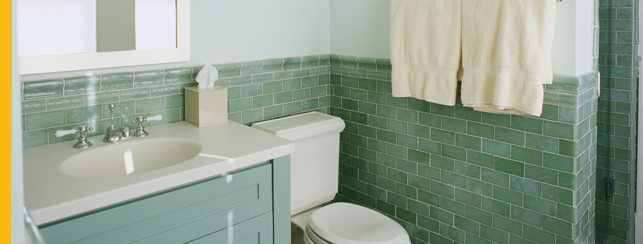
Rich Statement Colors
Two-tone walls can also support dramatic color choices. Strong combinations can establish memorable focal points in dining rooms, powder rooms, or designated feature areas.
Consider pairings like:
Terracotta and warm sand
Forest green and creamy white
Navy blue and soft gray
For the best balance, one color should take the lead while the second plays a supporting role within the room.
How Two-Tone Walls Change the Feel of a Room
Two-tone walls can influence how homeowners perceive the height, width, and overall scale of a room. Applying a darker shade to the lower section of a wall can visually anchor the space, helping an expansive room feel more comfortable and contained. Keeping the upper portion lighter directs attention upward, creating the impression of taller ceilings and a more luminous interior.
In open-concept homes, coordinated color changes can create subtle boundaries between connected rooms without introducing actual walls. Even a modest adjustment to where one color ends and another begins can determine whether the room feels larger, warmer, more refined, or more dramatic.
Four Popular Ways to Divide a Two-Tone Wall
A two-tone treatment does not need to divide the wall into two equal halves. Choosing a different proportion often gives the design a more sophisticated and customized appearance.
1. Chair Rail or Wainscoting
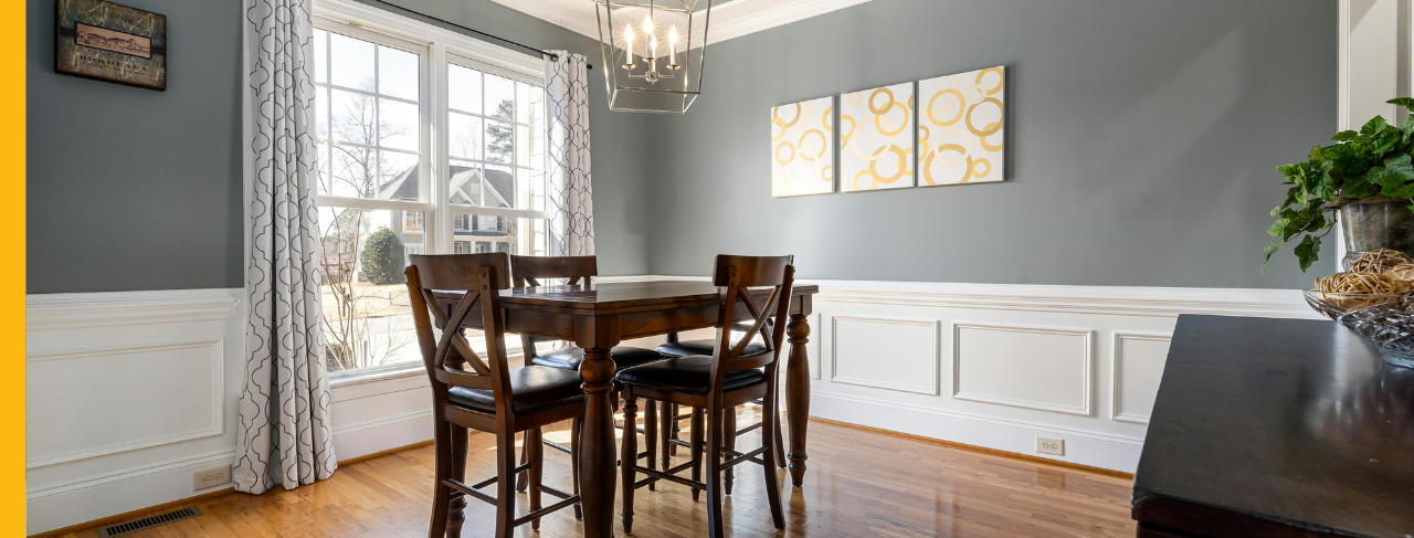
This is among the most established ways to introduce two colors. Homes with chair rails, beadboard, or wainscoting already have a natural dividing line, allowing one color to be used below the architectural feature and a second color above it.
The approach is particularly effective in dining rooms, entryways, and corridors.
2. Lower Third
Painting roughly the bottom third of the wall in a darker shade creates visual weight near the floor. The lighter upper portion then keeps the room from feeling enclosed.
This proportion works well in bedrooms, children’s rooms, and relaxed family living areas.
3. Upper Accent Band
Another option is to apply a contrasting band near the ceiling instead of darkening the bottom of the wall. This modern technique creates an unexpected decorative element and can make the walls appear taller.
4. Color Blocking
Homeowners do not need to divide every wall. A large painted rectangle behind a headboard, workstation, fireplace, or media center can create the impression of a custom architectural feature. Color blocking also helps furniture feel anchored without relying on additional wall décor.
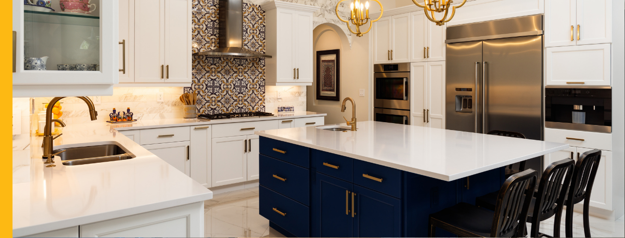
Two-Tone Ideas Beyond the Walls
The same two-color approach can be applied to more than the walls themselves.
Homeowners frequently bring coordinated colors into cabinets, built-in storage, and painted furniture. Two-tone kitchen cabinetry is especially popular, with deep lower cabinets and lighter upper cabinets creating contrast while helping the room retain an open appearance.
Window seats, built-in shelving, mudroom storage, and similar architectural features can also be painted in supporting colors. Carrying a consistent palette through several elements of the room can add personality while ensuring the full interior feels connected.
Professional Painting Makes the Difference
The basic idea behind a two-tone wall may seem simple, but creating perfectly straight separation lines calls for detailed preparation and skilled application. Professional painters use precise measuring methods, high-quality masking materials, and careful cutting-in practices to prevent uneven edges and color bleed. Color consultation can also help homeowners evaluate how paint choices will coordinate with cabinetry, floors, lighting, furniture, and existing finishes.
The result is a space that appears cohesive, purposeful, and professionally painted.
Transform Your Home with Two-Tone Walls
Two-tone walls make it possible to add color, dimension, and architectural character without committing to extensive remodeling. From gentle neutral pairings to high-contrast modern palettes, the right color placement can redefine the appearance and mood of an interior.
Homeowners in Poway and East San Diego can contact CertaPro Painters® of East San Diego/Poway for help selecting compatible colors, choosing an effective dividing layout, and achieving crisp, polished results throughout their homes.

