2021 Color Trends We Love
Posted on January 11, 2021
Happy New Year! It’s so nice to have 2020 behind us. At CertaPro Painters of the CSRA, we are looking forward to 2021 and fresh starts! As we are looking forward to the new year, new colors are all around us.
Owning a business you get to decide which parts you delegate and which part you keep for yourself. We kept the color consultations for ourselves because we love meeting with people and it’s like shopping every day! What goes together? Where can we bring together colors we want and colors that we’re stuck with? How can we figure out what makes this family agree on a color together? How can I help people find their design inspiration? When we are visualizing how great something can look and trying to get to the heart of what’s going to make someone happy in their newly decorated space, that is my joy.
But color consultations aren’t about what we love- it’s about helping you find what you love!
Urbane Bronze
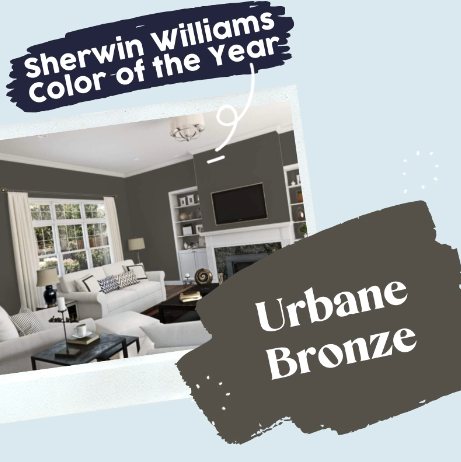
The Sherwin-Williams color of the year for 2021 is Urbane Bronze (SW7048). It’s a rich neutral with warm taupe undertones. If you move up the color card, you’ll see Porpoise and Felted Wool as well as amazing gray. Because Urbain bought bronze is such a rich color, you will want to save this color as an accent piece. And a kitchen that would mean the stove hood or island, or in a kitchen that would be in the stove hood or island, or the guest bathroom, or even the dining room. It is a color that says you have arrived! It pairs very well with rich reds and rust colors. It stands out well with cream or bright white trim. If you feel like this is too bold of a color, you can back it off to a less intense color by choosing Porpoise (SW7047) or Anonymous (SW7046).

Aegean Teal
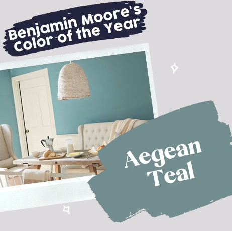
Benjamin Moore’s color of the year Aegean Teal (2136-30) is a rich jade, evoking stormy sea waters. It makes a perfect backdrop to spicy cinnamon red tones or dusty pink tones such as Antique Rose. Neutrals within sight should be light taupes, Such as Abalone (2108-60), or a clean fresh white such as Chantilly Lace (2121–70). Think of colors from the seashore and vibrant sunsets to set a romantic color palette.

Pearly White
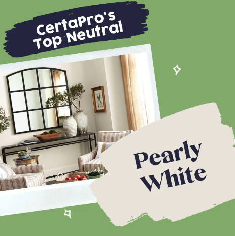
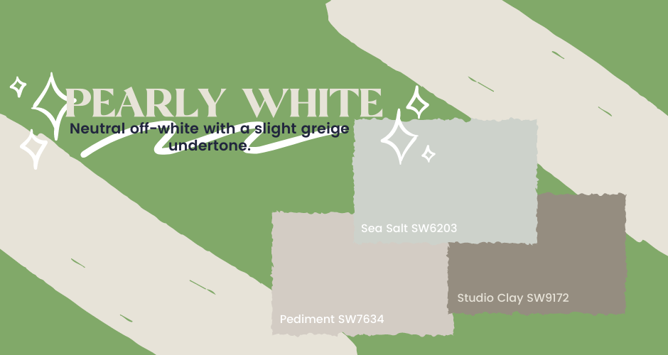
Pearly white is a go-to for white on white pairings. It adds some depth with a slight taupe undertone. It pairs well with destination colors that are light and airy (such as sea salt and pediment) as well as with rich accents (like studio clay). Soaring ceilings with pearly white will feel open and lift the space even further. We love this color because it adds a touch of depth and luxury to any minimalist space.
Sierra Redwood
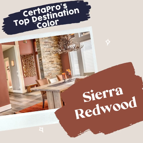
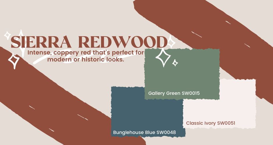
Sierra redwood (SW7598) is a rich coppery red. It is an intense, warm color, with orange skewing undertones. It feels formal and classic for your dressier destination rooms or guest spaces. You could use this in your formal dining room, or even in a kitchen with bright white cabinets.
If you are craving color after years of light, washed-out tones, you could use this shade to create a more historic vibe. Pair it with Gallery Green (SW0015) or Bunglehouse Blue (SW0048) and add rich cream trim to give it that historic twist. We recommend Classic Ivory (SW0051). If you want to stick to a modern, highly defined look, stick to a bright white trim.
Cyberspace
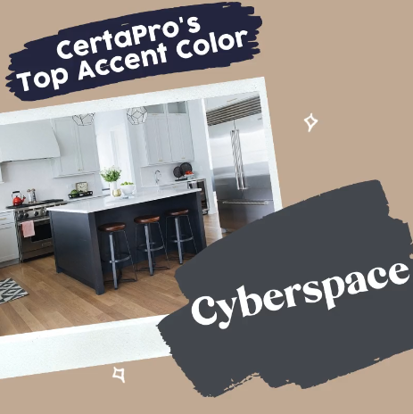
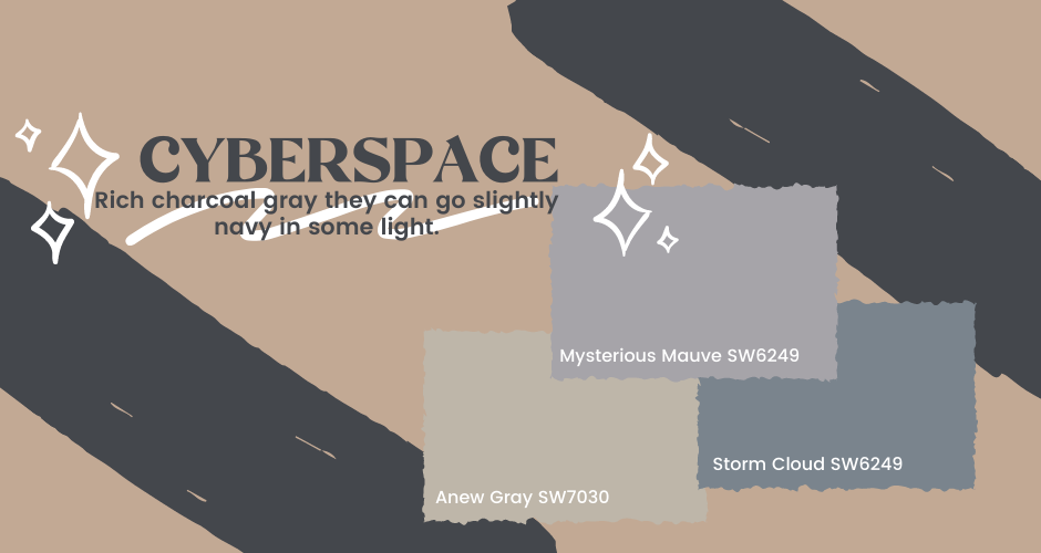
Cyberspace (SW7076) is a rich charcoal gray they can go slightly navy in some light. This is a strong color and not for the weak or faint of heart! If this is a destination color, for your dining room, for instance, it would pair well with a bright white wainscoting. this would also look great as a guest bathroom wall color. Especially with bright white countertops, floor or cabinetry! We also love Cyberspace as a front door color! Or even a cabinet color to accent your kitchen island. This color looks great with Dusty blues and dusky plums such as Storm Cloud or Mysterious Mauve. This dark rich gray adds a beautiful contrast to crisp white trim.
