
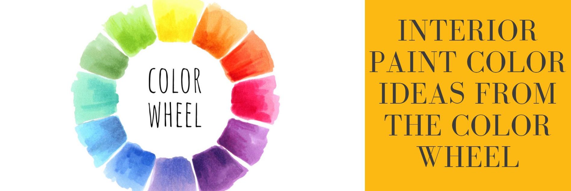
Interior Paint Color Ideas From The Color Wheel
Posted on September 20, 2021


How to Use a Color Wheel When Selecting Interior Paint Colors
The color wheel is a design tool used to help understand relationships between colors. Color wheels can be a great resource when selecting colors for rooms with multiple tones, accent walls, or to help balance the colors through the rooms of a home. The color wheel identifies color families that belong together, by using it as a reference it will show you what options you have for complimentary and contrasting colors quickly.
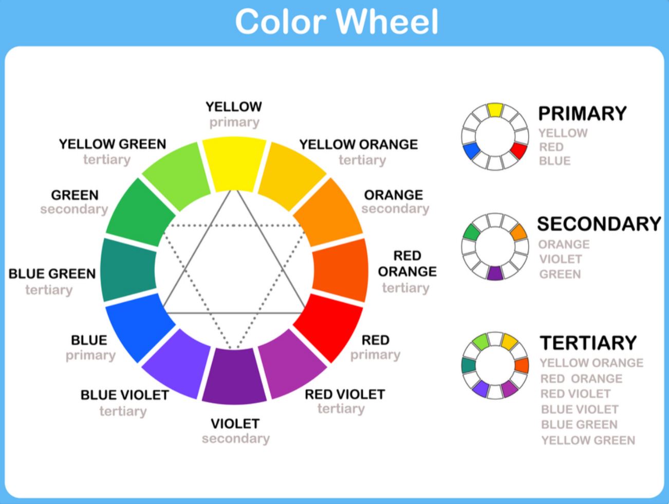
Primary Colors
Every color, white excluded, comes from a primary color. Red, blue and yellow are combined to create every other color.
Secondary Colors
When two equal parts of primary colors are mixed, secondary colors are created. Examples of this include red and blue making purple, and blue and yellow making green.
Tertiary Color
When primary colors are mixed in varying amounts (one part to two parts) tertiary colors can be created. Violet is created by mixing two parts red with one part blue.
The Effects of Color
It’s important to take the effects of a color into consideration for each room you are choosing to paint. Some of our customers want their dining room space to feel bright and warm, and their bedroom to have a relaxing color palette. When selecting colors for an interior paint projects this is a great first place to start – what mood are you trying to set for the space in the home you are painting?
Adjacent rooms
Keep in mind adjacent rooms that can be seen from each other. It’s a good idea to choose colors that compliment each other. Pay close attention to spaces like hallways, you want your hallway color choice to match well with all of the connected interior rooms. A good way to test this is to pick a few colors and paint them onto posterboards. Hang these in the hallway and see how they look from each room.
Warm and Cozy
Below are the colors that make up the warmer tones of the color wheel. Start here if you are looking for the color of your room to give a feeling of warmth.
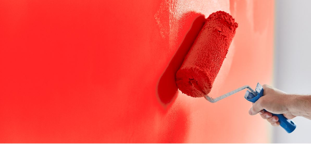
Red is the color of energy, passion and power. Because it’s an appetite stimulant, it’s a common choice for dining rooms, kitchens and restaurants.
Orange is less aggressive and brings a feeling of joy and warmth. It can be an overwhelming color so it’s a good idea to use orange as an accent or trim.
Yellow is normally a happy and uplifting color. It can be taken too far where it’s found to be distracting. It’s best used in pastel or accent versions.

Cool and Soothing Colors
On the other end of the color wheel are cool colors, these are often thought to be relaxing. They enhance calm and create a spa-like atmosphere.
Green is representative of growth. As a naturally occurring color, green blends easily with natural wood furniture or other colors found naturally.
Blue is generally thought of as a peaceful color. It makes a room feel refreshing and relaxing. A dark blue is tied with a sense of dignity.
Violet fuses the energy of red with the calmness of blue. Violet often is used in bedrooms for serenity and passion.
Pastels
Pastels can be made by adding large amounts of white to primary colors on the color wheel. They are a popular choice and give the room an open an airy feel.
Neutral Colors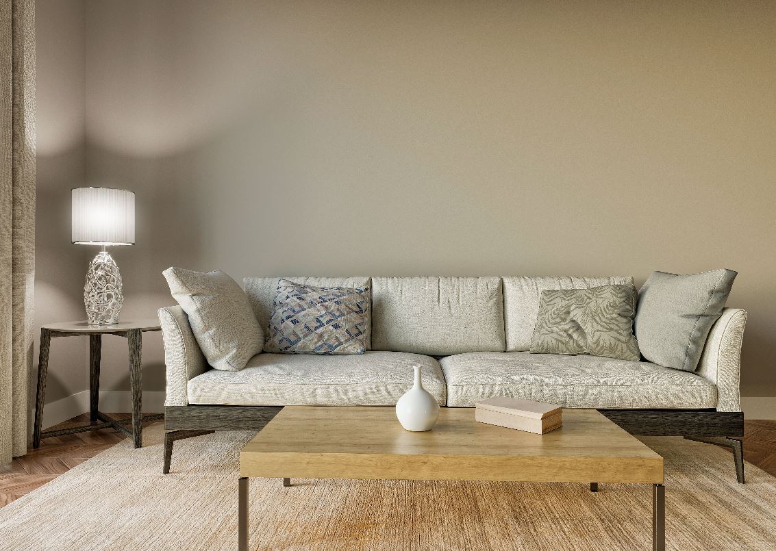
Neutrals are a perennial choice for painting a home. White, beige, taupe, gray and even black are chosen more than any other options. This is because they are easy to match and work with. Neutral colors are a safe choice when looking to sell a home. They pair well with white molding and trim for a modern, classy, interior look.
Color Schemes
Complementary Colors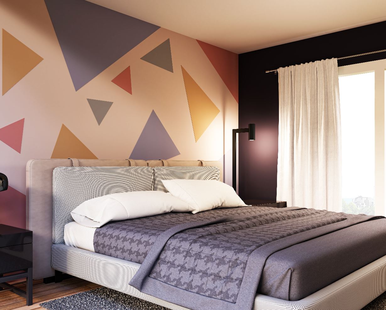
Complementary colors are found opposite each other on the color wheel. They share a richness that works together in a room. When choosing these colors, one should be dominant and one less. For example, a dark violet is best paired with a light to medium yellow.
Split Complementary Colors
Split complementary colors offer a daring color option. Select your main color. Next, find the complementary color and select colors from each side of the complementary color. These colors are great to try when layering a faux finish.
Related Colors
Related colors are located directly next to each other on the color wheel. By choosing these colors, there is less contrast and more complementary feel. If you choose a dark blue-green and match it with a light blue, you get the feeling of a tropical lagoon.
Monochromatic Colors
Using the same color, but in different tones and saturations creates a stylish and always matching options. A paint card from your local paint or big box store is an example of these color options. It’s a pleasing and forward thinking color scheme.
