Interior Paint Color Spotlight: Pink
Posted on February 28, 2020


February, the month of hearts and heart health, is a great time to talk about the color red or for the purpose of this post the softer side of this dynamic hue, pink. Red, closely associated with life itself, has maintained its classic status since antiquity and is still used, though not as much, in homes to bring a dynamic punch of color. Today, in celebration of the beginning of a new decade, a world in need of quiet reflection and the growing use of natural materials of stone, wood and metals a palette of pastel color and a magnitude of sophisticated neutrals are emerging.

One hue to keep a watchful eye on and celebrate in of the month of February is the softer and nurturing color of pink. This soft pastel hue was a holiday favorite and has been given a place on several home décor and paint company color trend forecast.
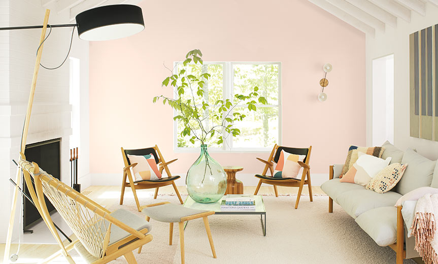
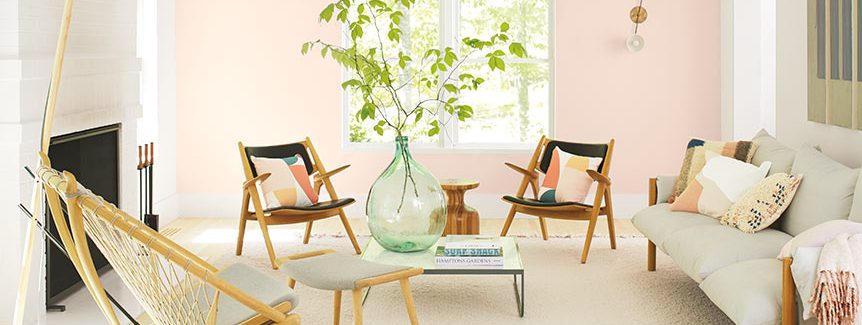
Benjamin Moore selected First Light 2102-70, a soft rosy hue, as their 2020 Color of the Year and Sherwin Williams, in their trend palette of 45 colors, also included a soft ethereal pink called Breathless SW6022.
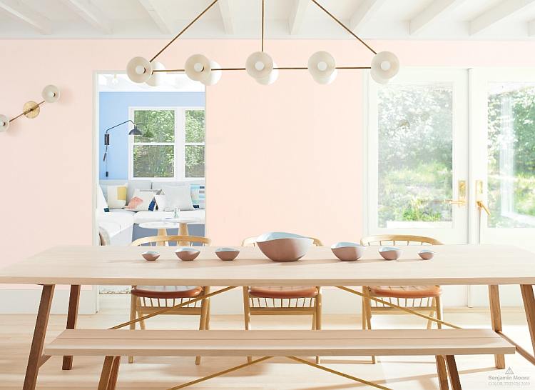
Both hues have just the right amount of warmth and neutral tone giving them a classic maturity and a simple elegance worthy of being used in any room. Just as we are layering up our winter clothing to bear the elements layer these pastel hues with sophisticated neutrals to provide instant comfort and an easy transition from the grays that have been a trend for years.