
Using Color Theory for Painting Healthcare and Medical Spaces
Posted on May 1, 2024


Did you know wall colors can turn up creativity or cooperativeness? Many offices and businesses use this to their benefit. When it comes to healthcare facilities, color can help bring healing and optimism into a room. If your medical office is ready for a renovation, you might be asking what colors are best for a medical facility?
At CertaPro, we know when you start to plan a commercial paint job of any sort, it’s important to choose colors that lend themselves to the goals of the building & the business.
Medical facilities can increase happiness, healing, and more with good color choices. Our CertaPro painters can help create the best healing environment possible with their painting & color expertise.
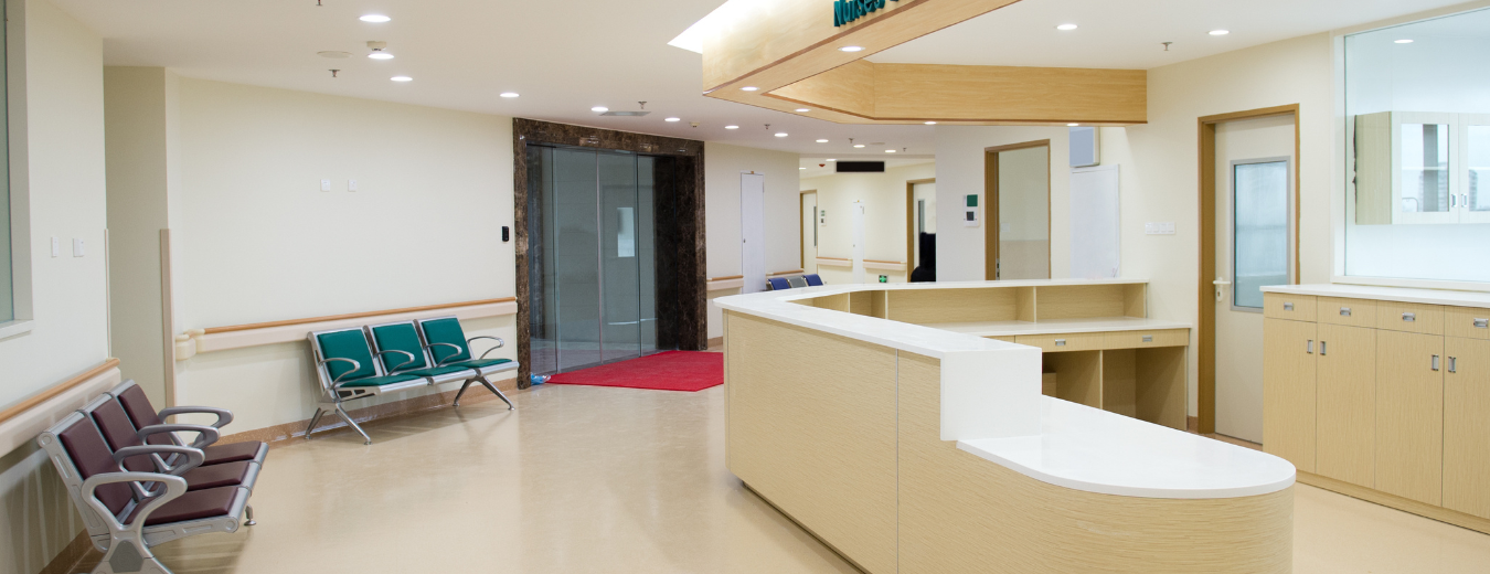
The days of sterile, stark-white waiting and patient rooms are gone, so here are some colors CertaPro painters think are good to consider when painting healthcare offices.
Red
You may be thinking that red is the wrong color for a healthcare environment. But actually, the warmth in red brings vitality and energy to a room. Blood pressure and adrenaline are increased with it, so avoid it in rooms for patients with hypertension. When used moderately, the color can help stimulate appetite and alleviate depression.
Orange
Orange has been widely accepted for use in children’s hospitals due to the benefits of the color. It gives off warmth, joy, and happiness. This could be due to the association with oranges and their Vitamin C antioxidant properties. The fruit can fight free radicals and the color can improve attitudes and outcomes.
Yellow
When it comes to healing colors, yellow should be on top of your list. Besides being bright and cheery, the color can stimulate intelligence and detoxify the body. For patients who are sluggish, yellow can help bring creativity and energy into the room. Some doctors say that if it’s overused, yellow can create issues with digestion and stomach problems, as well as cause insomnia. So careful use is suggested.
Green
Natural green gives off balanced healing properties. The color is restful and is known for growth and renewal, something all patients could benefit from. Experts have noted the color is great for circulation, including the heart and lungs. Greenery in patient areas also promotes comfort and equilibrium, good qualities for patients and waiting rooms.
Blue
Blue is known widely for its properties of calm and serenity. Like the sky and sea, blue can help with high blood pressure and fast heart rates. It’s widely used in spas for the serene feel it gives a room, something that can be employed in healthcare facilities. Besides the calming effects, the color is associated with eyes, ears, nose, and the senses around those.
Pink
While pink is mostly associated with femininity, it also gives feelings of caring and affection. It’s a color that is healing and soothing. Because of the happiness, it brings into a room, places like hospitals and prisons have used it to encourage calmness and reduce erratic behavior.
Purple
Purple, and its cousin violet, are connected with spirit and healing. While the colors are widely connected with insight and higher consciousness, in hospitals purple can help with issues in the cerebral and nervous systems.
How to use healing colors in healthcare facilities?
Design experts can utilize colors associated with healing particular disorders in treatment rooms. Experts suggest using colors that encourage openness, healing, and anti-anxiety for rooms that you use for 1:1 or group therapy.
These colors can increase good outcomes for patients when combined with expert treatment.
Pediatric treatment areas, like doctors’ offices & health clinics, utilize color therapy in the rooms within their buildings. Bringing in color helps keep smaller patients calm and stress-free while helping caregivers stay relaxed as well.
Since these pediatric offices normally have murals and colorful art on the walls, it’s easy to incorporate these calming colors into the design.
What about older patients?
When working with those in the elderly community, you should take into account that they could be suffering from vision issues. Avoid bright colors and lights, instead, make the patients comfortable with lighter counterpart colors.
If the area is already brightly lit, it is best to go less vibrant.
Many critical care units can benefit from pastels in blue, violet, or green. They are calming and soothing while reducing stress. For these intense areas, you should avoid colors that cause energy and stress like red, yellow, or orange.
These are just a few ideas about using color in healthcare offices & businesses.
Our CertaPro painting experts can help you decide the best color options and can help you plan the whole healthcare office painting project in detail with no stress involved!
We are experts in commercial painting projects and color consultation.
Ready to start your commercial painting project? Call your CertaPro painters at 775-851-8575 or schedule a free estimate online. Get started today!
