Popular Non-Neutral Interior Colors for 2020 In Northern Arizona
Posted on January 20, 2020
If you’re tired of the standard colors on your walls and ready for a refresh, step outside of the box to choose something new. Update the look of your home with a new color from these trendy paint colors that will give you a fresh start. Each of these would work just about anywhere in the country but they are colors we have painted in the last year for interior spaces in the Northern Arizona area. Some of these (like fir green) work to compliment the landscape of the Flagstaff area.
Lilac

Lilac has often been relegated to the color of the bridesmaid gown. It’s finding new life in homes as a relaxing and stylish color. From the taffeta, to the walls, this pale blue purple is perfect for little girls and grown women. When layered with furniture, textiles and walls, it’s a luxurious color perfect for the boudoir.
Using it for a little girl’s room is simple. Pick a lilac with pink undertones. Pair it with white or light accessories and furniture for a cheerful and playful room. It will last her through her young years and into the teen ones.
Cranberry

Red is a hard color to work with on walls. The effects can affect your heart rate and blood pressure in a negative manner. Use this muted version with brown undertones to make the walls feel more natural. Cranberry is a deep and decadent color to work with in your home. Pair it with natural or raw wood to tone down the deepness and give the room a scholarly feel.
The most popular color combination now is cranberry and bright blue. The combination includes deep cranberry walls and bright blue furniture or textiles to liven up the color scheme. It’s a stylish and unexpected color scheme.
Fir Green

Jewel tones like emerald have been long passe on the walls. Don’t think that green is out of the realm of possibilities. Use this darker, deeper green to give you a thoughtful and style-forward room. It’s a perfect option for an office or library. Go minimalistic with furniture and take the rest of your color inspiration from nature.
You’ll also notice the color counteracts the coldness of the laptops, cell phones and electronics your office houses. It’s a nod to the forest and times before you needed all of these gadgets to get your work done.
Nautical Blue

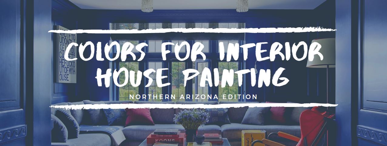
Blue is a perennial choice for wall color, but it’s normally seen in light and pale versions. Take a stand with this deep blue-green Nautical Blue. It’s a great choice for a statement color paired with stark white to give you a seaside home. Pair it with stainless steel for a chic kitchen option.
The newest trend is to pair deep navy with mauve and cream. Match wooden furniture for a romantic bedroom with a nod of whimsy. Use it in a guest room that will remind guests of the most forward thinking bed and breakfasts.
Nautical blue is a great choice to carry throughout the house, particularly in the common areas. Try it in an entryway that is traditionally a stark white room with little style. This color brings in a friendly feeling to welcome guests. Match it with light and bright colors to avoid overwhelming the eyes first thing in your entrance.
If you’re looking to add one of these colors to your home, contact our estimators for a free, in-home estimate today.


