


Designing Two-Tone Walls: Color Combinations and Ideas for Every Room
Posted on July 25, 2026


Selecting a paint color has the power to completely refresh a room, while selecting two coordinating colors can produce even greater visual impact. Two-tone walls feature complementary paint colors within the same wall surface, adding dimension, defining important architectural elements, and creating a tailored design that feels deliberate rather than overwhelming.
This technique continues to gain popularity in both traditional and modern homes, including interiors throughout La Jolla. Two-tone walls, however, offer practical design advantages beyond their current popularity. With thoughtful planning, they can visually raise a ceiling, bring warmth to a large room, emphasize trim or built-in features, and help distinguish different zones in an open-concept interior.
Whether you envision a restrained pairing of soft neutrals or a noticeable contrast between dark and light shades, there are several things homeowners should know before beginning a two-tone interior painting project.
Key Takeaways
- Two-tone walls do more than make a room visually interesting. Using a pair of complementary colors can define areas, showcase architectural details, and modify the overall atmosphere without requiring renovations.
- Select a coordinated palette. Colors that share compatible undertones—or a neutral paired with a stronger accent—can create contrast while keeping the room harmonious and balanced.
- Where the colors meet affects the appearance of the room. Chair rail divisions, lower-third treatments, upper accent bands, and color blocking can make ceilings appear higher, large interiors feel more comfortable, or selected features stand out.
- Two-tone palettes work in many areas of a home. Living rooms, dining rooms, bedrooms, workspaces, entrance halls, built-ins, and kitchen cabinets can all benefit from carefully coordinated colors.
- Professional application creates the most precise result. Straight dividing lines, smooth transitions, and knowledgeable recommendations regarding colors and placement contribute to a polished finish that lasts.
Why Choose Two-Tone Walls?
Applying two colors within one room is not merely a way to create contrast. It can also influence how the size, shape, and mood of the room are experienced.
Some of the most valuable benefits include:
- Making walls seem wider or ceilings appear higher
- Adding architectural definition without renovation work
- Creating visual boundaries in open living spaces
- Calling attention to fireplaces, built-ins, decorative molding, or trim
- Introducing stronger color while preserving a timeless sense of balance
Two-tone walls intentionally guide attention around the room. When properly designed, they can make the space feel layered and distinctive while still complementing the home’s existing style.
Start with a Color Palette That Works Together
Choosing two shades that work successfully together is a central part of creating an effective design.
Warm & Traditional
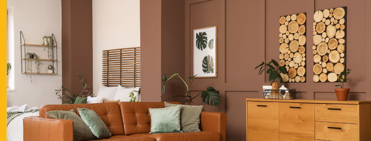
Warm color palettes bring a comfortable and welcoming quality to interiors, making them particularly appropriate for dining rooms and living areas.
Examples include:
Cream and warm taupe
Soft beige and chocolate brown
Ivory and muted olive green
These pairings create understated dimension without sacrificing a classic and timeless appearance.
Bright & Airy
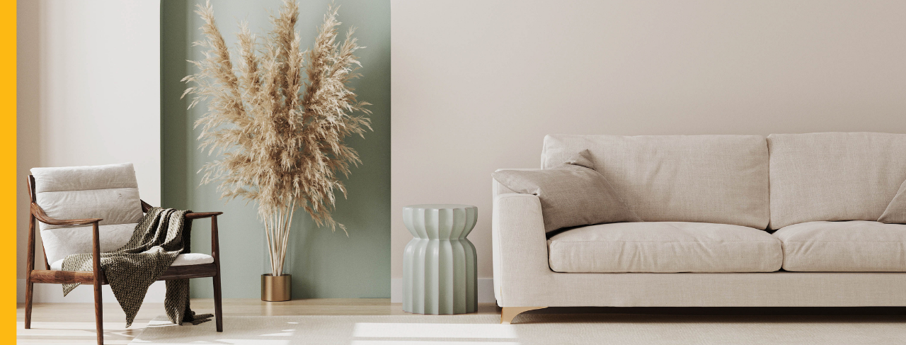
Lighter palettes are often ideal for bathrooms, bedrooms, and rooms with substantial natural light because they help interiors feel peaceful and spacious.
Popular pairings include:
Crisp white and pale sage
Soft gray and white
Warm white and dusty blue
Each combination adds soft contrast while allowing the room to remain bright and uncluttered.
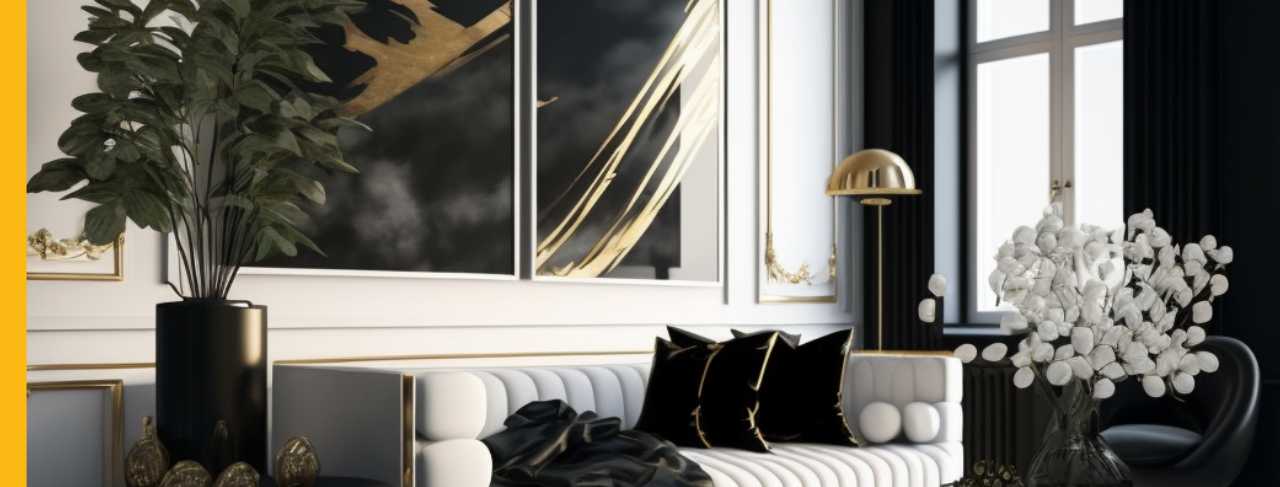
Modern Contrast
A light neutral paired with a deep accent shade can give a room a contemporary look defined by clean, dramatic lines.
Examples include:
White and charcoal
Greige and deep black
Mushroom and navy blue
These combinations often work especially well in entryways, home offices, and updated living spaces.
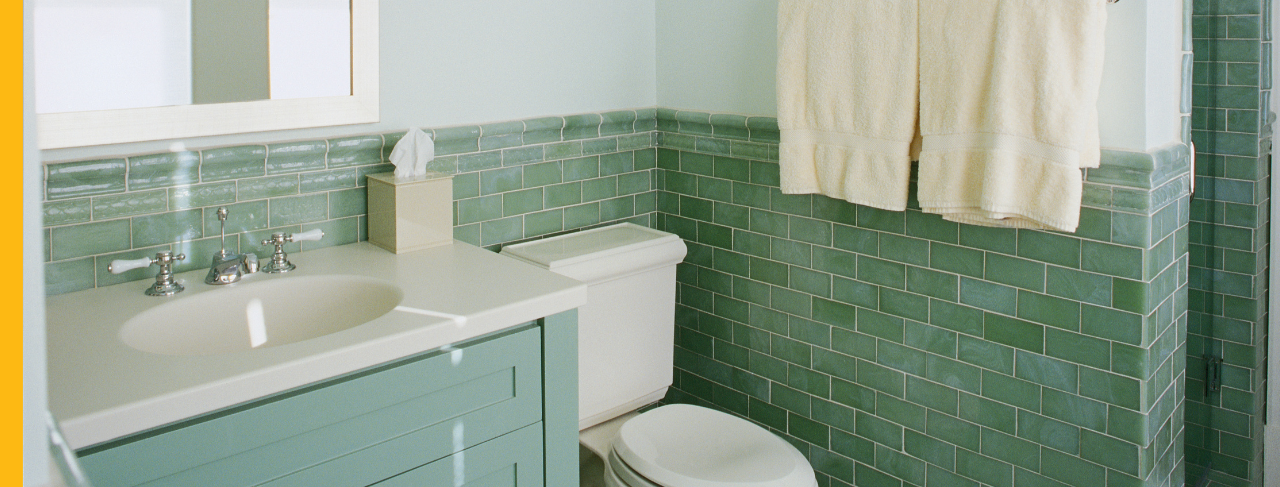
Rich Statement Colors
Two-tone walls can also accommodate more expressive color combinations. Bold pairings can establish striking focal points in dining rooms, powder rooms, and feature walls.
Consider pairings like:
Terracotta and warm sand
Forest green and creamy white
Navy blue and soft gray
Maintaining balance is important. One paint color should function as the primary shade, while the second color reinforces and complements it.
How Two-Tone Walls Change the Feel of a Room
The placement of two paint colors can change the way a room’s dimensions are perceived. A deep color along the lower section of the wall adds visual weight and can make an oversized room feel more intimate. In contrast, a pale color across the upper portion draws attention toward the ceiling, helping the room appear taller, lighter, and more open.
Within an open floor plan, shifting from one coordinated combination to another can indicate where one functional area ends and another begins, all without constructing walls. The height and location of the dividing line can have a major effect on whether the interior feels expansive, cozy, formal, or contemporary.
Four Popular Ways to Divide a Two-Tone Wall
There is no rule requiring two-tone walls to be divided directly at the center. Unequal proportions frequently make the finished design look more purposeful and visually refined.
1. Chair Rail or Wainscoting
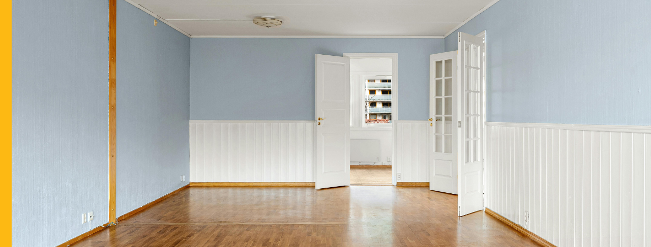
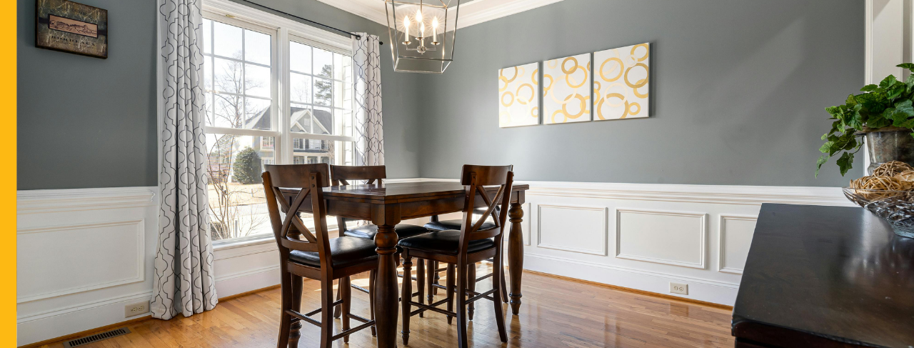
Chair rails, wainscoting, and beadboard provide natural places for two paint colors to meet. Applying one shade to the lower wall and a coordinating shade above the trim emphasizes the existing architecture.
This classic arrangement is especially appropriate for dining rooms, hallways, and entrance areas.
2. Lower Third
Painting the lower third of a wall in a darker color creates a stable, grounded effect. Keeping the remaining upper section lighter prevents the room from feeling heavy or closed in.
This style is frequently used in bedrooms, children’s spaces, and informal living rooms.
3. Upper Accent Band
A contrasting band placed close to the ceiling offers an alternative to the traditional darker lower wall. The technique works well in modern interiors, drawing attention upward and making the wall height feel more substantial.
4. Color Blocking
Instead of carrying a dividing line around the entire room, homeowners can paint a defined rectangular section behind a bed, desk, fireplace, or television area. This method can suggest a built-in feature and visually frame furniture without adding more decorative objects.
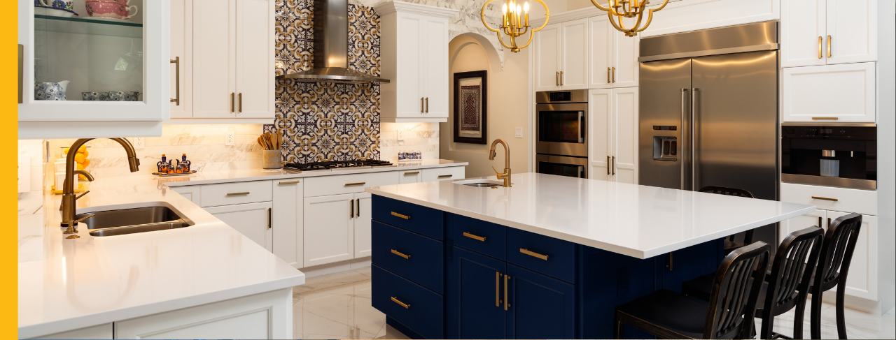
Two-Tone Ideas Beyond the Walls
Two coordinated paint colors can also be used on surfaces other than drywall.
Kitchen cabinets are a common example, with darker base cabinets paired with lighter upper cabinets. This arrangement provides visual stability while helping the kitchen maintain an open, balanced feeling. Similar palettes can also be introduced through furniture and built-in architectural elements.
Mudroom lockers, bookcases, storage benches, and window seats can be painted in related colors to introduce additional depth. Repeating the palette in several areas creates continuity and helps the room feel thoughtfully composed.
Professional Painting Makes the Difference
Two-tone painting requires more precision than its simple appearance may suggest. Straight and consistent dividing lines depend upon careful measuring, dependable masking materials, and accurate cutting-in. Professional painters also know how to minimize paint bleeding and create smooth transitions between colors. With color consultation services, homeowners can evaluate how each shade will interact with flooring, cabinets, lighting conditions, furnishings, and existing décor.
The completed interior feels coordinated, well balanced, and professionally finished.
Transform Your Home with Two-Tone Walls
Two-tone walls allow homeowners to bring dimension, character, and distinctive color into a room without completing a major renovation. Whether the desired look involves quiet neutrals or a bold contrast, carefully planned color placement can transform both the appearance and atmosphere of the space.
Homeowners in La Jolla can work with CertaPro Painters® of La Jolla to compare complementary shades, identify the most effective layout for each room, and achieve clean, professional results that turn their two-tone ideas into a finished design.

