


Two-Tone Walls for Every Room: Design Inspiration, Color Pairings, and Painting Tips
Posted on July 25, 2026


Choosing one new paint color can dramatically change an interior, but using two complementary colors can give the room even more personality and visual dimension. Two-tone walls combine coordinated shades on the same wall to create depth, highlight architectural features, and establish a customized look that appears thoughtfully planned rather than visually overwhelming.
Two-tone painting has become increasingly common in both traditional and contemporary homes, including properties throughout Chula Vista. The approach offers more than fashionable visual appeal. When carefully designed, two-tone walls can make a ceiling appear higher, give a spacious room a cozier atmosphere, draw attention to architectural details, and visually organize an open-concept floor plan.
Whether you prefer a subtle relationship between neutral shades or a bold contrast between light and dark paint colors, homeowners should understand the possibilities before starting a two-tone interior painting project.
Key Takeaways
- Two-tone walls provide benefits beyond added color. Two complementary shades can distinguish spaces, emphasize architectural elements, and change the mood of an interior without requiring remodeling.
- Make deliberate color choices. Selecting shades with similar undertones or pairing a neutral paint color with a bold accent can establish contrast while maintaining a unified design.
- Color positioning influences the room’s appearance. Chair rail splits, darker lower thirds, upper accent bands, and blocked areas of color can make ceilings feel taller, large rooms seem more intimate, or focal points become more noticeable.
- Two-tone color schemes can be used in many spaces. Bedrooms, dining rooms, living rooms, offices, entryways, kitchen cabinetry, and built-ins can all benefit from coordinated two-color designs.
- Professional painting creates sharper results. Clean separation lines, consistent transitions, and expert advice on color and positioning help produce a refined finish designed to last.
Why Choose Two-Tone Walls?
Painting a room with two colors is not only a decorative exercise. The arrangement can significantly influence the way the room feels and functions.
Some of the main benefits include:
- Giving walls the appearance of greater width or height
- Creating architectural interest without construction work
- Visually separating living zones in an open floor plan
- Highlighting fireplaces, shelving, trim, and built-in features
- Adding color while keeping the design balanced and enduring
By directing attention to selected areas, two-tone walls can give the room additional movement and depth while remaining consistent with the home’s broader interior style.
Start with a Color Palette That Works Together
The success of a two-tone wall begins with finding two paint colors that complement each other.
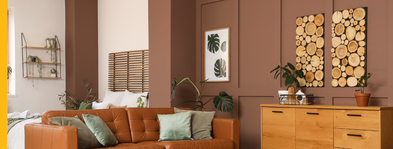
Warm & Traditional
Warm palettes can give living and dining spaces a welcoming atmosphere that feels comfortable and familiar.
Examples include:
Cream and warm taupe
Soft beige and chocolate brown
Ivory and muted olive green
These combinations introduce depth in a subtle way while preserving a traditional and timeless character.
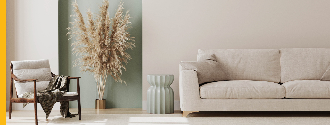
Bright & Airy
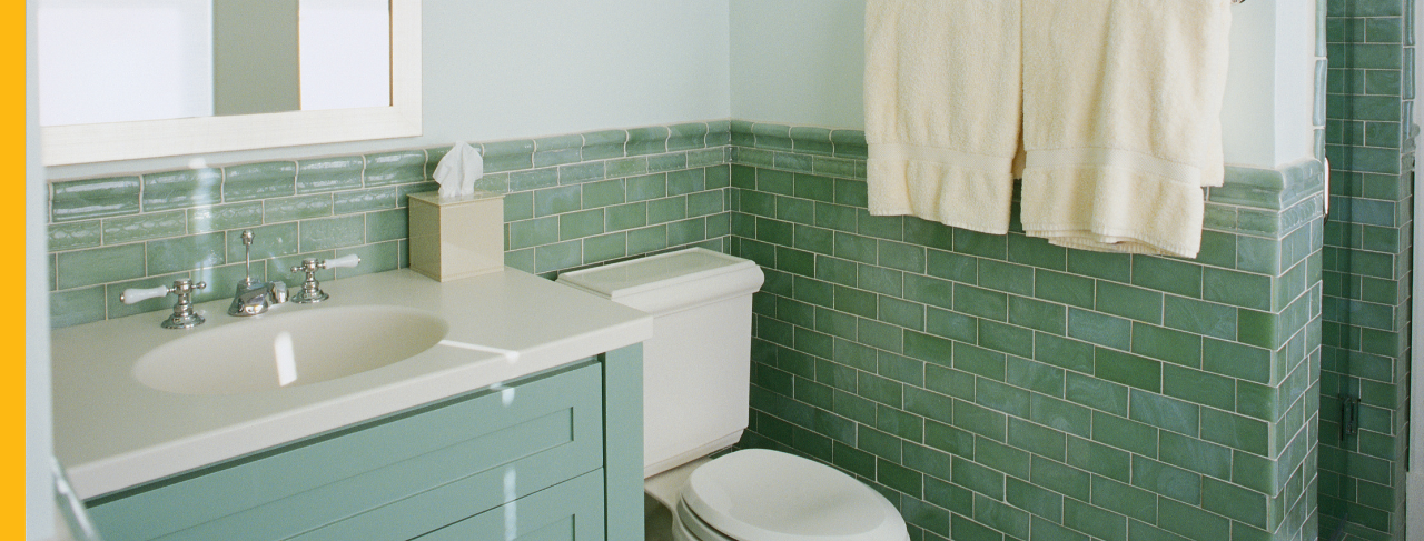
For bathrooms, bedrooms, and other interiors with abundant daylight, pale color combinations help create a relaxed and open feeling.
Popular pairings include:
Crisp white and pale sage
Soft gray and white
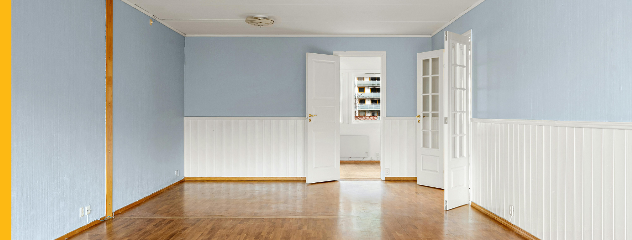
Warm white and dusty blue
These pairings add enough contrast to keep the room interesting without allowing the colors to overpower the space.
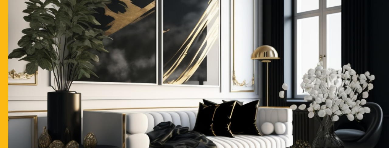
Modern Contrast
A pale neutral combined with a much deeper accent color can create a contemporary interior with strong, well-defined lines.
Examples include:
White and charcoal
Greige and deep black
Mushroom and navy blue
These colors are especially effective in modern living rooms, home offices, and entry spaces.
Rich Statement Colors
Homeowners do not have to limit two-tone designs to pale or restrained shades. Stronger combinations can create memorable feature areas in dining rooms, powder rooms, and other smaller spaces.
Consider pairings like:
Terracotta and warm sand
Forest green and creamy white
Navy blue and soft gray
The strongest designs maintain a clear hierarchy, with one color serving as the leading shade and the second providing support.
How Two-Tone Walls Change the Feel of a Room
Color placement can influence how the eye interprets the proportions of an interior. A darker shade applied to the bottom portion of the wall creates a visual foundation, which can help a large room feel more intimate and comfortable. A light shade above it draws attention upward, making the ceiling appear taller and the room feel brighter.
Different color combinations can also distinguish connected areas in an open floor plan. Without adding doors or partitions, homeowners can visually separate a dining space, sitting area, or workspace. Even a relatively simple adjustment to the position of the color division can make a room feel larger, warmer, more elegant, or more contemporary.
Four Popular Ways to Divide a Two-Tone Wall
The line between two colors does not need to sit in the exact center of the wall. In many cases, an asymmetrical division produces a more stylish and carefully designed appearance.
1. Chair Rail or Wainscoting
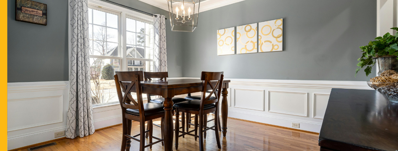
A chair rail, wainscoting, or beadboard creates a convenient architectural boundary between two colors. Painting the area below the trim in one shade and the wall above it in another draws attention to these established details.
This traditional technique works especially well in hallways, entryways, and dining rooms.
2. Lower Third
Applying a deeper shade to approximately the bottom third of the wall gives the room visual stability. The lighter color above it preserves brightness and prevents the space from appearing too enclosed.
This approach is well suited to children’s rooms, bedrooms, and comfortable family spaces.
3. Upper Accent Band
A contrasting strip placed near the ceiling offers a more unexpected interpretation of the two-tone look. Commonly used in modern interiors, an upper band can visually stretch the wall and bring attention to the height of the room.
4. Color Blocking
Two-tone painting does not have to extend across the full wall. A painted rectangular section behind a bed, fireplace, desk, or entertainment unit can act as a visual frame. This creates the effect of an architectural installation and helps anchor furnishings without additional accessories.
Two-Tone Ideas Beyond the Walls
A coordinated two-color palette can continue throughout other painted surfaces in the room.
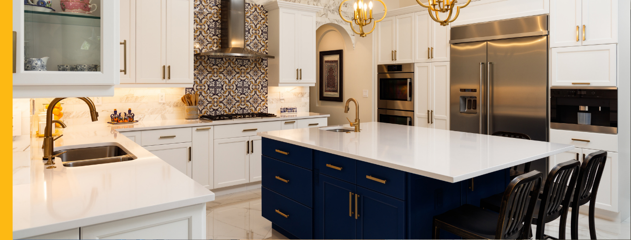
Kitchen cabinets often feature this strategy, with dark lower cabinets combined with lighter upper cabinets. The deeper base color grounds the kitchen, while the upper color keeps it feeling spacious and balanced.
Built-in shelves, storage lockers, window seats, benches, and painted furniture can also use colors from the same palette. Repeating these shades in selected architectural elements introduces depth and personality while helping the room feel cohesive rather than overly decorated.
Professional Painting Makes the Difference
Creating an attractive two-tone wall involves more than choosing two colors and applying paint. The transition between the shades must be carefully measured, masked, and painted to avoid crooked lines, inconsistent edges, and bleed-through. Professional painters use detailed preparation and precise cutting-in methods to create a clean division. They can also provide guidance regarding how prospective colors will work with the flooring, cabinetry, natural and artificial lighting, furniture, and existing décor.
The final result is a coordinated interior with a balanced, intentionally designed appearance.
Transform Your Home with Two-Tone Walls
Two-tone walls give homeowners a practical way to introduce depth, color, and architectural character without completing a full renovation. From understated neutral palettes to bold modern combinations, the location and proportion of each color can completely reshape the room’s appearance.
Homeowners in Chula Vista who are considering a two-tone interior can rely on CertaPro Painters® of Chula Vista for help selecting compatible colors, determining the ideal placement, and creating sharp, professional results that complement the home.

