

How to Choose the Right White Paint
Posted on October 25, 2021


White paints are initially deceiving when it comes to color selection, choosing a white paint can be trickier than it appears to be on the surface. With our interior painting season starting up, we thought it was a good time to present the variables to consider when selecting what white paint to use for your painting project.
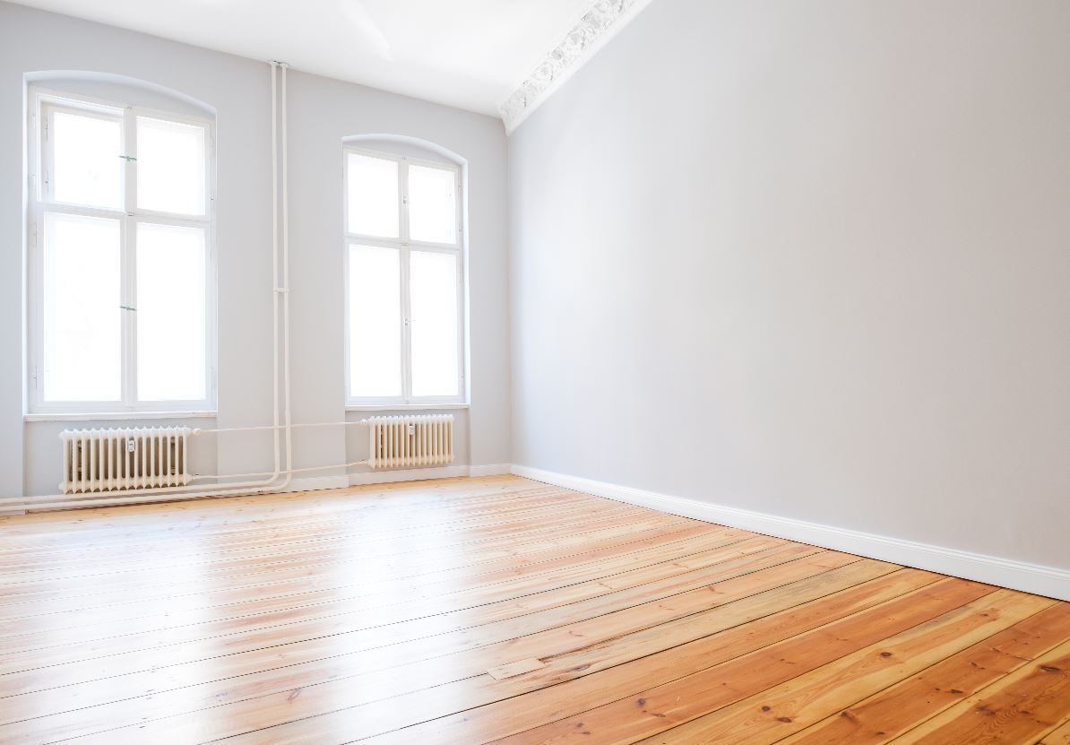
White paint is a little like a chameleon, it will appear different depending on the lighting, room, and adjacent colors. A pure white interior wall with a natural white light bulb can appear to be off-yellow in color. The same pure white next to a blue wall may appear to have a slight tint of the blue from the adjacent wall. Getting the right white for your project can be difficult, but there are some methods you can use to help with the selection.
When selecting a white in the paint store, you may see products with labels like white, extra white, and pure white, it can be confusing to select on name alone. The reality of the situation is that none of these are likely to appear exactly white after being painted in the room due to factors described above (lighting, color of furniture, accessories, accent walls).
Here are the items to think about and keep in mind when selecting a shade of white:
 Consider the lighting in the room
If your space has lower natural light, a cool white will look shadowy and gray. Pick a white with warm undertones to make it look more welcoming. If the room is lacking in outside lighting through windows, consider even a greige instead. The space will feel white and opened up, but not cold.
If your interior does not get a lot of natural light, a cooler white may appear darker than it did in the store. For rooms without natural light we recommend a white with warm undertones that help ease the lighting in the room. If a room has no natural light at all, consider going with a light gray or greige color instead.
The opposite is true as well. If your room has an abundance of natural light flooding in, a cooler white with blue tones will keep the color from presenting as a yellow.
Suggestions:
Sherwin-Williams Extra White for a well lit room with a modern look.
Sherwin-Williams Pure White for a lower light room that has a soft feel.
Don’t forget about trim
Almost all of the time homeowners overthink their trim. Experts suggest always going for an untinted white. Don’t worry about tones and shades. The white will be find in small amounts, like trim, and won’t show up as a tinted, toned color.
For trim, we usually suggest going with an untinted white. Trim does not need the same level attention to tone and shades as walls do. This is because in small amounts, like trim, the tints and tones wont show nearly as well. There are of course exceptions to this rule. Items like Kitchen cabinets, or wainscoting, any area with large areas of flat surfaces should get closer attention to the shade of white. For cabinets we often use choose either Sherwin-Williams Extra White or Benjamin Moore White
Variances in shade and color
Choosing to paint a whole room white can give it a very sterile feel. Instead, vary the colors by several shades within the same warm or cool family. Using creamy or blue toned whites will give the room more depth while still reading white. This can be done with accent walls, variations in trim color, or even variances in between the wall and the ceiling.
Selecting a finish for white paint
Finishes will also play a role in how a white painted surface will look and feel. Flat finishes are good for ceilings, and pair well with eggshell whites on the walls and trim. Rooms where water comes into play, like the kitchen and bathroom may be better served with higher gloss finishes.
Test areas before making a final choice
The most sure way to know if a color will work in your home is to do a thorough test. Bring home samples and paint a large swath of the color on the wall. If you aren’t sure you want to paint, experts suggest painting a poster board and hanging it in various places around the room to test for color, lighting and furniture compatibility.
