10 Best Office Paint Colors to Improve Productivity
Posted on May 4, 2020
Picking a paint color for your home is an easy prospect. You choose something you can work with and appeals to your style. When the room is meant for work, the color can have an affect on how productive you are in it. Here are the 10 best office paint colors to improve productivity.
Color can be useful when enhancing the use of the room. A 2012 study found that, among other things, a white office is read as clinical and boring. Rather than have an unwelcome office, at home or place of business, read these options.

Stimulate with Blue
Blue is a stimulating color creating a feeling leading to productivity. This is true with nearly all blues in the rainbow. Repetitive industries found this color particular useful and had increased output after changing the color.
Red is Urgent
Red can create a sense of urgency, which is why it’s used for emergency services like fire trucks and ambulances. Other organizations can benefit from stimulating red walls, like construction companies or engineering firms.
Get Emotional with Yellow
Yellow is an emotional color, so it is perfect for those in creative industries. It’s a happy color that can bring up spirits, which could be why it’s regularly painted in therapy offices and counselor’s quarters.
Green Balances the Room
Green is a color that lends itself to calmness and reassurance. Working in the ups and downs of the financial industry could be the perfect place to paint your office the color of money.
Now that you may have an idea of what works before for your particular industry, here are 10 suggestions for the best paint colors for your office.
Off-White
Avoid clinical by using an off white color. This is a softened version of the color that still reads clean yet warmer than stark white. If you want a clean, pure white, use Benjamin Moore’s Simply White. This is a clean color to pair with a bright accent wall.
Teal
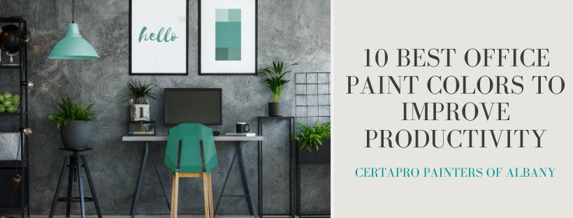
Since teal is a combination of green and blue, using it brings the productivity and balance of each of the primary colors. Do not overdo it and use a bright, vivid teal throughout the office. It’s best kept to an accent or statement wall. St. John Blue by Benjamin Moore goes well in an office when paired with gray.
Gray
Gray won’t do a lot for mood, but soft grays are great to pair with the brighter, mood-helping colors. This avoids the clinical white feeling and adds a classy gray. Use Classic Gray by Benjamin Moore for a subtle backdrop.
Light Blue
Light blues are an often chosen option for offices. It brings stimulation in the room without overpowering it. The lighter versions of blue are often opted for in spas and offices that need some relaxation. Use Ralph Lauren’s Salisbury Point for peace and calm. It’s a perfect choice to put in a medical office where doctor’s deal with nervous patients daily.
Blue-Gray
Mix stately gray with blue to get a clean and respectable color for your walls. Avoid a moody color that’s professional with Silver Mist by Benjamin Moore.
Brown
Brown reads as strong or powerful. When it’s paired with wooden furniture, it’s a power couple in colors. Try Wainscot by Farrow & Ball for a brown that’s warm and pair it with Tudor Brown by Benjamin Moore in eggshell to lighten the room.
Pastel Yellow
Creatives flock to yellow offices to help get their juices flowing. Choose a variation of the color with gold accents for an easy to live in office that isn’t overpowering. Butter Regal Matte by Benjamin Moore is a perfect option.
Purple
Give a room a feminine touch with purple like Benjamin Moore’s Charmed Violet. This color is a quiet lavender perfect for a spa or dog groomer. If you want more drama, choose Delicious Berry by Behr. It’s good for an office that is not afraid to be shy.
Green
Healthcare and financial industries need to be seens as trustworthy and knowledgeable. Do it with a rich green on the walls. Farrow & Ball’s Mere Green is the perfect touch of green and warm undertones.
Orange
Orange is intense to say the least. Painting all four walls in the bright color can overpower a person’s eyes. Creating frenzy with the color could work if you’re looking to up the ante in a gym. If not, try a color like Baja Orange by Ralph Lauren Paints to bring the energy up on sluggish afternoons.
________________________________________________________________________________________________________________________________
CertaPro Painters has crews dedicated to painting office spaces. We create custom palettes and schedules to appeal to every office or commercial space. If your business is in need of a paint refreshing, contact us. We’re here to help! Schedule an appointment with our estimators to discuss your project today.


